A great embedded analytics solution can enhance data-driven decision-making and lead to improved outcomes with powerful, high-impact dashboards.
Too often, unfortunately, valuable business data is obscured by a bad presentation. Overcrowded dashboards with confusing and misleading information keep users from extracting actionable insights.
Dashboards and analytics are only useful when users can understand them.
This is where embedded analytics tools come in handy – they let you turn your data into a story with great visual UI elements and UX.
In this article, we’ll be sharing the core principles of creating high-impact UI/UX dashboards with embedded analytics to improve your end-user’s decision-making process for maximum profitability.
What Is the Difference Between UI/UX?
In a nutshell, UI (user interface) is the series of pages, screens, and visual elements that enable the user to interact directly with a product or service. On the other hand, UX (user experience) is a user’s complete experience when they interact with every aspect of a company’s product or service.
UI is anything that a user accesses and interacts with when using your product or service, including menus, buttons, forms, icons, images, typography, icons, search fields, etc.
UX encompasses every little detail and many user interfaces that roll up into one to form a seamless user experience for the end-users interacting with the product or service. These details include usability, function, ease of navigation, etc.
Despite the slight differences between UI and UX, both elements are crucial in product development and work closely together to determine how a product will look and function – with one influencing the other. There is no UI without UX and vice versa.
Imagine that you have created the most beautiful website, but then fail to realize that people find it hard to navigate and can’t find what they are looking for. Regardless of how beautiful the UI is, without a good UX, users will become frustrated and leave never to return to your website.
What Is Dashboard UI?
Dashboards are powerful tools to influence users’ decision-making processes. They help users get at-a-glance information on their most important KPIs and metrics and display relevant and actionable data. A high-impact dashboard is possible and can be created through dashboard UI design.
If you design a modern UI dashboard, you will provide your users with the data they need, in an easy-to-scan and understand format. Here are some other key benefits of a great dashboard UI:
- They communicate data insights quickly
- They display data clearly and efficiently
- They display trends and changes in data over time
- All essential information is immediately accessible
- All essential information is displayed on a single screen
- They provide opportunities to drill down the data for more information
- Chart, tables, and other visual elements are displayed in a minimized view with the ability to bring up more details in a modal window with more information
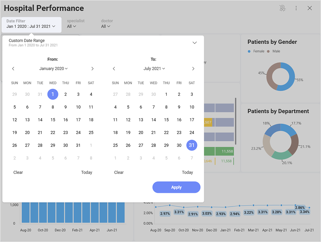
- They allow users to filter and customize data using labels, categories, and KPIs
- They allow users to easily navigate to other areas of the application that require their attention
Guiding Principles of Great UI/UX Dashboard Design
A high-impact dashboard UI can be a daunting thing to design. Especially if you don’t know where to start. But following the dashboard design best practices that we list below makes the goal achievable. To ensure you design a modern UI for your dashboard, follow these 12 UI/UX principles:
1. Define the Purpose of the Dashboard
The dashboard has a specific purpose to serve, and if you get that wrong from the beginning, even if you follow all other dashboard design best practices, the result will be meaningless.
There are 4 dashboards categories to choose from:
- Operational– for business intelligence purposes, the operational dashboard goal is to monitor, measure, and manage operations on a more immediate or shorter time scale.
- Strategic– used for long-term business strategies to analyze the most essential information based on trends.
- Tactical – used to help formulate strategies for growth in mind-management circles.
- Analytical – for displaying large bits of comprehensive data to analysts and other business users, helping them create insights that help the business grow.
2. Understand Your Users
Dashboards communicate data stories; the golden rule of communication is knowing your audience. To follow the principles of high-impact dashboard design, you need to identify your targeted audience – the people who will read the information you present within that dashboard.
You will communicate the dashboard data differently to a technical user than to a business user or if you are making a sales pitch to a client or a presentation to your company’s executives.
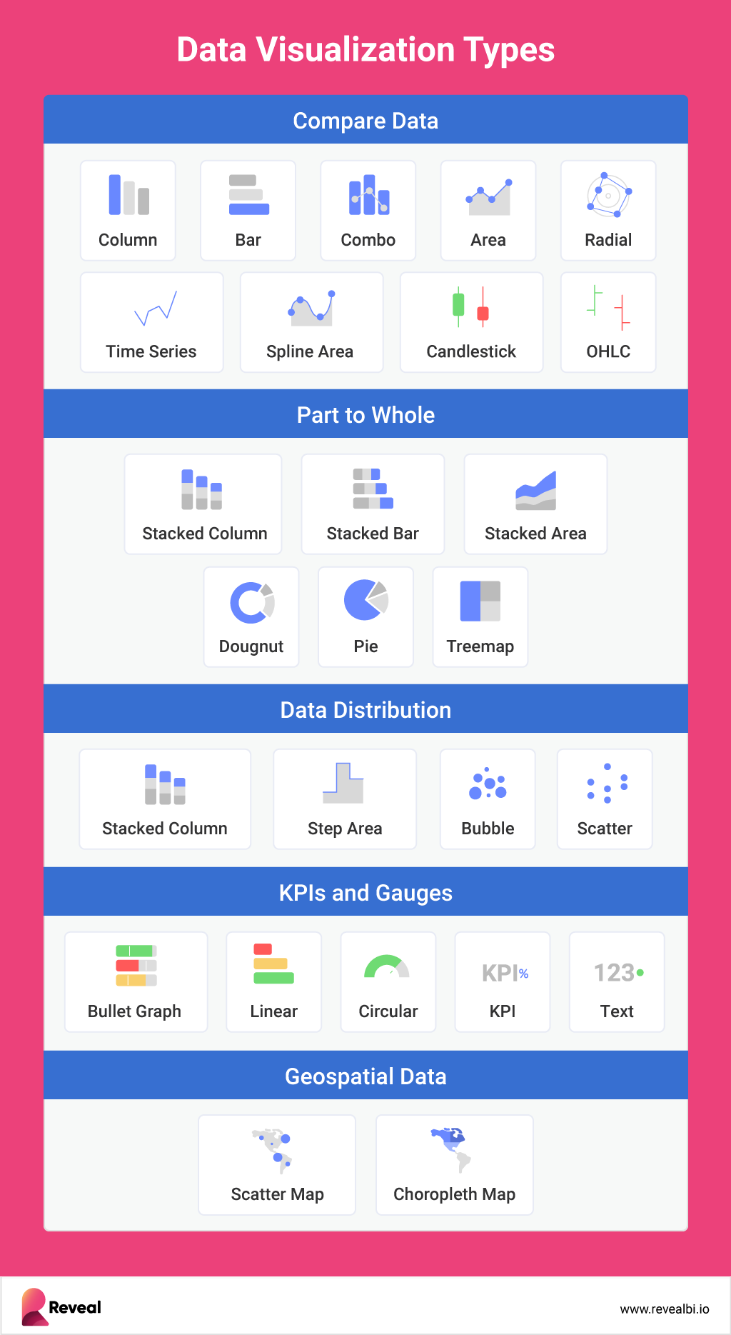
3. Choose the Right Chart Types
One of the biggest challenges of effective dashboard UI is picking out the right chart type to visualize the data to the audience you’ve already identified. There are infinite chart types to choose from, and each has unique attributes that can help you best get your message or data story across.
And while your data could work with multiple charts, it is up to you as the dashboard UI designer to make sure you select the chart type that makes the data clear and concise for your audience.
When choosing a chart type, think of these key questions:
- What is the key point you want to communicate with your chart?
- Do you want to compare variables?
- Do you need to understand the distribution of the data?
- Are there possible trends you need to analyze?
Choose the point you want to make and select a chart type that is optimal.
4. Display the Essential Data
While this might sound obvious, it is not – we’ve seen so many examples of dashboards full of distractive and unnecessary data and elements, haven’t we?
The challenge here is to find the balance between the data you CAN display on a dashboard and the data you SHOULD display on it. We know it might be tempting to add every possible chart and filter into your dashboard, but will that make it effective and high-impact – no!
Make it easy for your users to find more information by providing them with access to dive deeper into the data in another area of your product.
5. Aim for Simplicity
Based on the logic from our previous point, dashboards not only need to display the essential data while not overwhelming users, but they also need to strive for simplicity.
Make your dashboard UI/UX design intuitive. For example, place the sidebar on the left-hand side of the screen where users would expect to find it.
Also, we’ll touch on this shortly but don’t overdo colors, graphics, effects, etc. Dashboards don’t have to be impressive or amazing – theyhave to be efficient.
6. Reveal the Context
A good, high-impact dashboard will also include descriptive titles and descriptions to help users quickly understand the data and easily navigate the dashboard.
Use descriptive and concise titles that give the users reason and explanation for your chart. Keep your chart title simple and to the point since your data and visualization should tell the core of your story. Your title should directly relate to and support the chart underneath it.
Furthermore:
- Sort your data alphabeticallywhen you are using categories on your x-axis, and you need to help people find what they are looking for quickly.
- Sort your data in ascending order when you need to help tell the story of growth.
- Sort your data indescending order when you need to compare largest to smallest.
7. Proper Use of Colors
Colors can help you highlight what’s important or they can derail your dashboard. But when speaking of colors, we all have a wide array of preconceptions regarding different colors. For example, red is commonly seen as a bad sign, while green is commonly seen as a good sign.
Naturally, as you’re designing your dashboard, you have to consider this and remember to keep basic design psychology principles in mind.
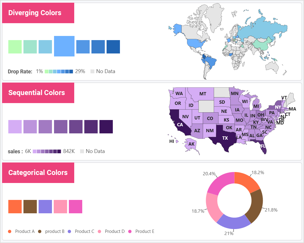
However, to avoid chart confusion and derailing from your story, there are three types of color schemes you can use on your dashboards – diverging, sequential, and categorical.
- Use diverging color schemes when a central value is shared between both ends.
- Use sequential colors with numeric or ordered values.
- Use categorical colors with distinct variables without any order.
8. Highlight What’s Important
Design visualizations to focus the user on the most important thing about your data story. Highlighting key points, trends, and bounds within your data can be key to providing your end users with the quick insights they need.
Use these key features when looking to highlight important data:
- Focus user’s attention on what you want them to look at by using series highlighting.
- Bring attention to key data points with conditional formatting. Set bounds that correlate to variations in your data.
- With chart annotations, you can support your data storytelling either on a chart or with collaboration. Annotations provide your users with insights deeper than data points.
- Use outlier detection to quickly highlight anomalies or deviations in a data set.
- Use time-seriesforecasting to make predictions for future data points based on past and present data giving your users predictive analytics.
- Linear regression allows you to plot trends between dependent and independent variables. Use linear regression when you want to show the “best fit” line to match (predict) the general trend in the data.
9. Use Effective Interactions
Modern data analytics programs make it easy to create interactions to allow users to slice and dice data to gain deeper insights into the questions they are looking to answer.
Some of the most effective interactions include:
Dynamic filtering – adding filters to your dashboard or visualization allows you to pivot your data on the fly to gain deeper insights. Provide different options for your users to slice and dice data by category fields or date ranges, either at the dashboard or visualization level.
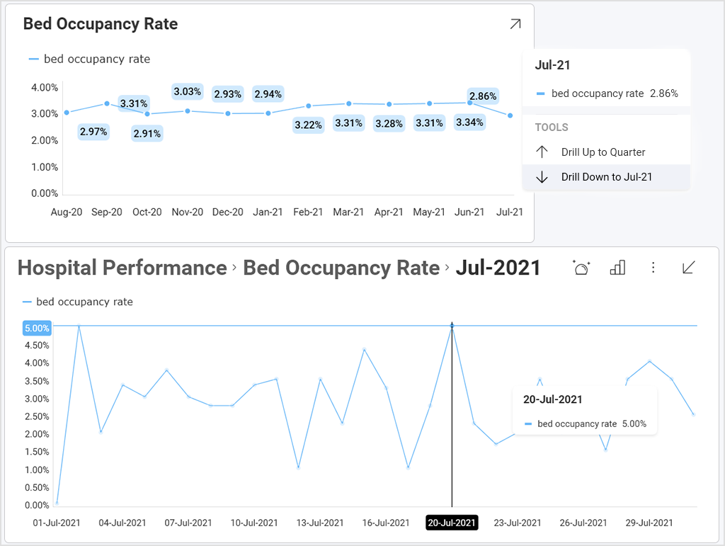
Drill-down – enabling hierarchies within your category or date fields allows your end-users to do deeper analysis.
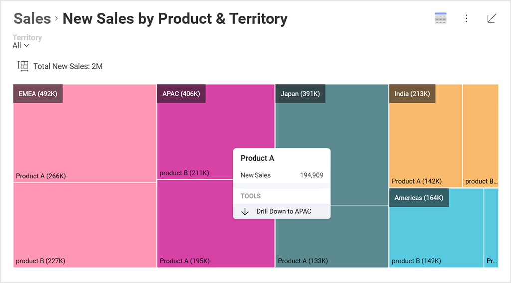
Treemap– treemaps are excellent visualizations for drill-downs as they display large amounts of hierarchical data in a compact space at a glance, and they show data as part of a whole.
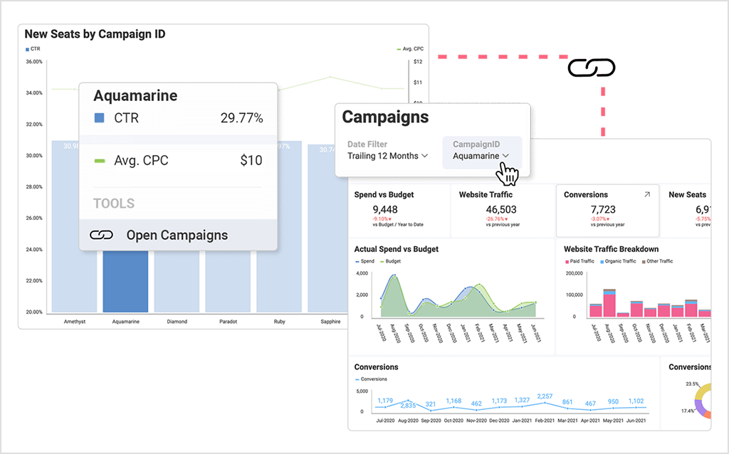
Dashboard linking – link data points or visualizations to other dashboards.
10. Double Your Margins
White spaces, also known as negative spaces, are the noticeable margins between metrics in your dashboard. The data story becomes hard to read if that white, negative space is not balanced.
Saving this area between the charts and elements of your dashboard will make it look wider and less overwhelming. You can use different views and data filters to double your margins and make it possible to display all the information on the same screen.
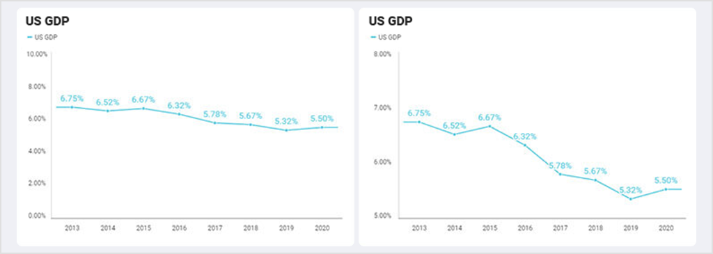
11. Use the Right Scale
The scale for a graph axis can significantly impact how an audience interprets a message within the data story and is an important part of optimizing data visualization.
The best way to avoid being guilty of misleading visualizations is to steer clear of changing the scale of the Y-Axis. This tends to tell a different story than the data should.
Here’s just one example of how a chart tells an incorrect story. Both charts show the same data. However, the right chart has the axis starting at 5%, making it look like the US GDP is plummeting. Whereas when you look at the left chart, there is, in fact, only a small gradual decline.
12. Pay Attention to Details
Sometimes details can enhance your dashboard UI/UX, but other times excessive detail confuses your message. For instance, keeping your numbers formatted or filtering out top results makes data more easily readable.
Formatting your data can be a quick, simple way to make the numbers more visually appealing and easier for an end-user to read. For either gauges or charts such as bar charts and column charts, you can adjust your data formatting to make your data point stand out: limiting the number of decimals, for example, or adjusting the placement of comma separators. Also, consider using currency, percentage measurements, or large number formatting.
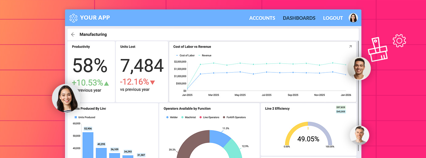
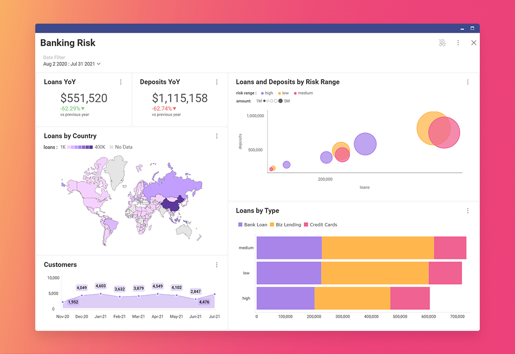
How to Create an Excellent UI for a Dashboard Using Embedded Analytics?
You have probably heard about embedded analytics and the booming demand for business intelligence insights that are derived from it. A recent survey by Reveal showed that embedded analytics platforms are soaring in popularity for their ability to make data-driven decisions, gain a competitive advantage and drive sales –with 58% of respondents embedding analytics in their apps for their own use in 2022, in comparison to 33% in 2021.
The primary reason for that is that embedded analytics platforms improve business decisions through high-impact dashboards. Embedded analytics brings real-time, interactive data visualizations and dashboards, and business intelligence capabilities directly into users’ workflow – creating contextual data that improves the usability of data for business users.
Providing users with relevant and timely insights within their workflow promotes a data-driven culture and encourages more analytical thinking. In-context analytics will enable your users to make faster and more intelligent decisions that are based on the information available at that moment or visible on the specific screen they are viewing.
Furthermore, a good embedded analytics solution comes with self-service capabilities that provide intuitive UI, making interacting with data more accessible for those who don’t have technical knowledge. With self-service capabilities, users can independently access and analyze data by themselves and build informative high-impact dashboards and reports.
Reveal is an end-to-end self-service embedded analytics solution that brings the power of data into the hands of your employees, customers, partners, and suppliers. At its core, Reveal is centered around data-driven decision-making, and it has been designed to allow you to easily integrate interactive dashboards and data visualizations, white-label capabilities, advanced and predictive analytics, including machine learning, forecasting, statistical functions, and more into your apps, so your users can access real-time insights and build beautiful and informative dashboards anywhere and on any device.
You can learn more about Reveal and how it work by downloading our SDK or by scheduling a quick demo.
Harness the Power of Data
Grow your business with real-time, contextual data.