Rigid dashboards slow teams down. They repeat the same limited charts, no matter the business context. Users leave your product to export data into Excel or Tableau. Developers drown in one-off requests. Leaders struggle to see insights that fit their workflows.
These problems cost SaaS companies adoption and retention. When analytics feels generic, users stop engaging with it. When they leave your app for answers, your product loses its stickiness. And when developers spend time on reporting, your roadmap slows down.
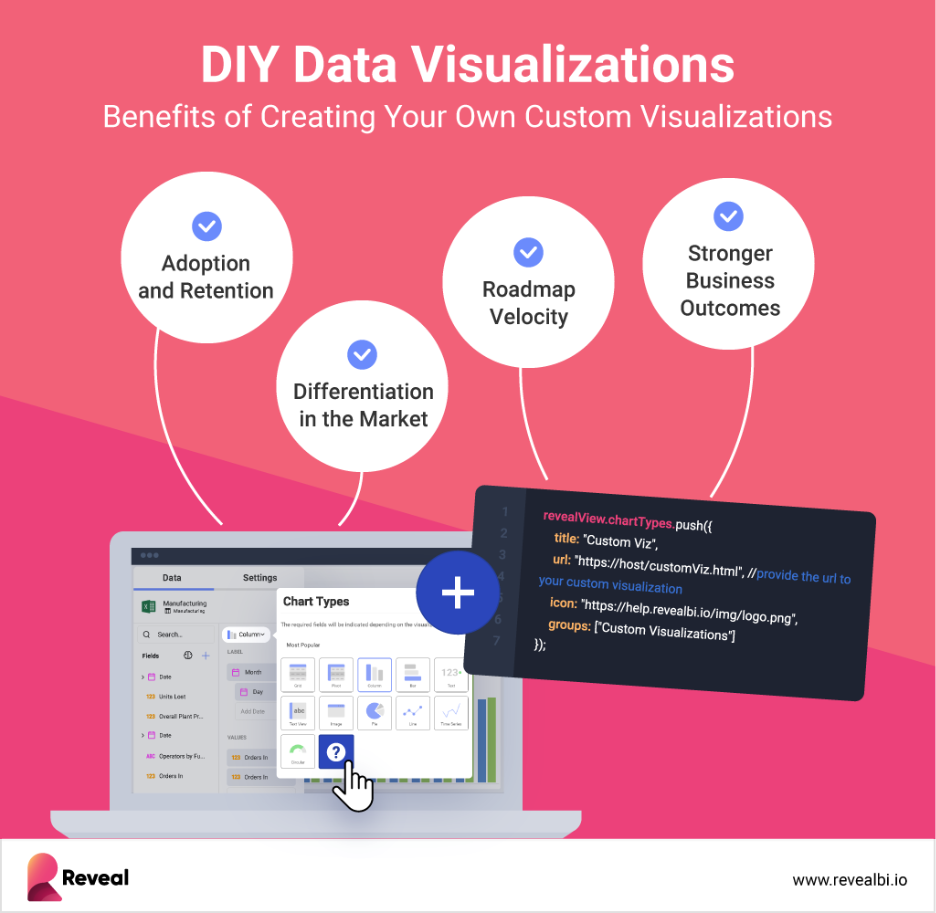
DIY data visualizations fix these problems. They keep analytics inside the product and make every chart relevant to the business context. Custom data visualizations adapt to workflows, KPIs, and use cases, boosting user trust and long-term adoption. SaaS leaders see faster decisions, happier customers, and a stronger competitive position.
The strategic value lies in solving these exact challenges, and that is where custom visualizations begin to stand out.
Generic dashboards look the same everywhere. They rarely answer the exact questions your customers have. This limits adoption and weakens product value. SaaS leaders cannot afford to have that, because weak analytics slows adoption, lowers retention, and makes products harder to differentiate.
The Strategic Value of DIY Data Visualizations
DIY data visualizations change the equation. They adapt to workflows, KPIs, and customer needs, making analytics a key part of the product experience instead of a generic add-on.
According to recent research, 81% of tech leaders saw higher demand for business intelligence and embedded analytics in 2024. The embedded analytics market is projected to reach$55.54 billion by 2030. These numbers show that flexible analytics is now a core capability.
DIY visualizations are strongest when combined with embedded analytics. This places insights within the workflow, instead of forcing users to use separate tools.
Adoption and Retention
When analytics feels relevant, users actually use it.
-
Tailored dashboards answer the questions customers care about most.
-
Contextual insights build trust and encourage repeat engagement.
-
Better analytics keeps users inside the product, improving retention.
Differentiation in the Market
SaaS products compete on features, but analytics can be a lasting differentiator.
-
Custom data visualizations highlight unique workflows and metrics.
-
Competitors with rigid dashboards cannot match this flexibility.
-
Analytics becomes a feature that sets your product apart, not one that drags it down.
Roadmap Velocity
Developer time is a scarce resource.
-
Without DIY visualization options, developers handle constant reporting requests.
-
With self-service, those requests drop, giving the roadmap room to move forward.
-
Faster feature delivery strengthens your competitive position.
Stronger Business Outcomes
Strategic value shows up in measurable business impact.
-
Data storytelling aligns teams and customers with clear narratives.
-
Better adoption means higher ROI on your product investment.
-
Interactive dashboards help business leaders to make faster, more informed decisions.
The value is clear at a high level, but the impact becomes even more obvious when you examine how DIY visualizations address the everyday challenges product teams face.
How DIY Visualizations Solve Core Pain Points
Strategic value becomes real when it solves everyday challenges. DIY data visualizations address the most common pain points product teams face, from rigid dashboards to wasted developer resources.
No More Generic Dashboards
Rigid dashboards do not adapt to unique workflows. They force every user into the same structure, regardless of their needs. This weakens adoption because teams cannot align visuals with their actual workflow.
DIY data visualizations fix this by allowing tailored dashboards. Each chart can reflect the specific KPIs and workflows of your product. This makes analytics meaningful, not generic, and keeps users engaged.
Reducing Developer Burden
When analytics lacks flexibility, developers become reporting teams. They spend hours creating ad hoc charts instead of focusing on product features. This slows down roadmap delivery and increases frustration.
With custom data visualizations, users can independently explore and edit dashboards. Developers regain time, while users get answers faster. 42% of organizations list limited tech resources as their main challenge with analytics. Self-service solves this directly.
Eliminating Exports to Excel or Tableau
When dashboards fall short, users export data to spreadsheets or external tools. This wastes time, creates security risks, and lowers adoption of your product.
DIY data visualizations keep analysis in-app. By connecting directly to live data sources, users always work with current and consistent information. Research shows that 61% of organizations juggle four or more BI tools, losing up to 40% of analyst productivity. Embedded approaches eliminate this waste.
Telling the Right Story with Data
Generic visuals do not persuade decision-makers. They provide information but fail to convey its impact. This gap hinders decision-making and undermines stakeholder engagement.
With custom data visualizations, teams shape narratives that resonate with their audience. Better data storytelling helps leaders and customers see context, not just numbers. This increases trust in the product and improves decision speed.
These solutions make it clear that generic tools cannot compete with the flexibility of a DIY approach, which raises the question of what really sets custom visualizations apart from prebuilt options.
What Sets DIY Data Visualizations Apart
Prebuilt chart libraries offer speed but little flexibility. DIY data visualizations go further, giving SaaS products the control and depth needed to deliver analytics that actually fit their users.
Flexibility Beyond Templates
Chart libraries come with fixed templates. They look the same everywhere and force users into rigid patterns. With custom data visualizations, teams decide how metrics should be displayed. Every chart and dashboard can be adapted to the workflow and audience.
Advanced Features That Drive Adoption
DIY solutions support more than static visuals.
-
Advanced charts that go beyond basic bars and lines
-
Interactive dashboards that allow filtering, slicing, and drilldowns
-
Responsive layouts that match any device or screen
This level of control enables SaaS leaders to deliver analytics that seamlessly integrate into the product, rather than being a disconnected layer.
Future-Ready Through AI
Flexibility also means staying ready for the next wave of analytics. Research indicates that in 2025, 90% of analytics users will transition into content creators through AI-driven tools, and context-driven ones will replace 60%of traditional data models.
With AI-powered analytics, users can surface trends, auto-generate visuals, and uncover insights faster. This shifts analytics from reactive reporting to proactive decision support.
This is why DIY data visualization stands apart. It allows teams to combine human creativity with AI speed, making analytics more useful and more widely adopted.
Flexibility is valuable in itself, but some product scenarios make custom visualization essential rather than optional.
When Custom Visualization Is a Must
Not every scenario demands flexibility, but some make it non-negotiable. In these cases, DIY data visualizations are the difference between a product that gets used daily and one that gets ignored.
Product Adoption and Stickiness
Adoption comes from analytics that feel native to the workflow. When users see insights at the right time, they are more likely to return to the product.
Interactive dashboards drive this behavior. They give users the freedom to filter, drill down, and adapt views without leaving the app. Products that deliver this type of engagement see stronger retention and long-term loyalty.
Competitive Differentiation
SaaS markets are crowded. Generic dashboards no longer stand out. Custom data visualizations highlight the specific metrics and workflows that matter most to your customers, giving your product a competitive edge.
A strong example is Commodity Centre. They embedded DIY data visualizations into their logistics platform, allowing users to track operations in real time. This not only improved efficiency but also built customer trust and satisfaction.
Monetization
Analytics is not just a feature; it’s a revenue driver. With white-label analytics, SaaS companies can package dashboards as premium tiers or upsell options.
Research shows that 31.4% of organizations already use embedded analytics to generate higher revenue. Custom data visualizations make this possible by delivering dashboards that match the customer’s brand, not just the vendor’s template.
Faster Decision-Making
Speed matters in competitive markets. Products that help users act quickly gain an edge. DIY data visualizations give leaders insights in context, at the moment decisions are made.
20.2%of customers adopt embedded analytics primarily to improve decision-making speed. By keeping insights inside the workflow, embedded visualizations eliminate the lag caused by exports or disconnected tools.
Meeting these needs requires more than theory. It depends on technology that can deliver DIY visualizations at scale.
How Reveal Enables DIY Data Visualizations
DIY data visualizations only deliver value if the platform behind them can scale. That’s where Reveal fits.
Reveal was built for SaaS teams that need embedded analytics as part of their product. It provides:
-
An embedded analytics SDK with full developer control, no iFrames
-
Responsive dashboards that adapt to any device or interface
-
Full white-label customization so analytics matches the product experience
-
Self-service tools so non-technical users can create and edit their own views
-
AI-driven features that bring flexibility and forward-looking insights
-
A transparent pricing model designed for predictable growth
This combination allows SaaS leaders to deliver custom data visualizations without slowing down developers or breaking the roadmap. Indeed, Reveal is not just a supporting tool, but the foundation for treating DIY visualizations as a true product capability.
Check out how effortless it is to create a DIY Custom Visualization with Reveal:
DIY data visualizations make analytics flexible, relevant, and part of the product experience. Reveal enables this shift with embedded tools that scale, letting SaaS teams deliver value faster and with less effort.
Explore how Reveal supports your product with analytics that users trust and adopt by booking a personalized demo.