
What Is Embedded BI?
Embedded business intelligence (BI) refers to the integration of BI tools and processes, such as taking data points and transforming them into visual resources that can be used by users to make intelligent business decisions. Tools and processes that are part of the embedded BI include collecting, storing, and retrieving data, the creation of reports, dashboards, and other data visualization based on that data, and more. Embedded BI is different from traditional BI because it is not a standalone application. Instead, the embedded analytics system puts all the capabilities of BI directly in context within the applications users already use.
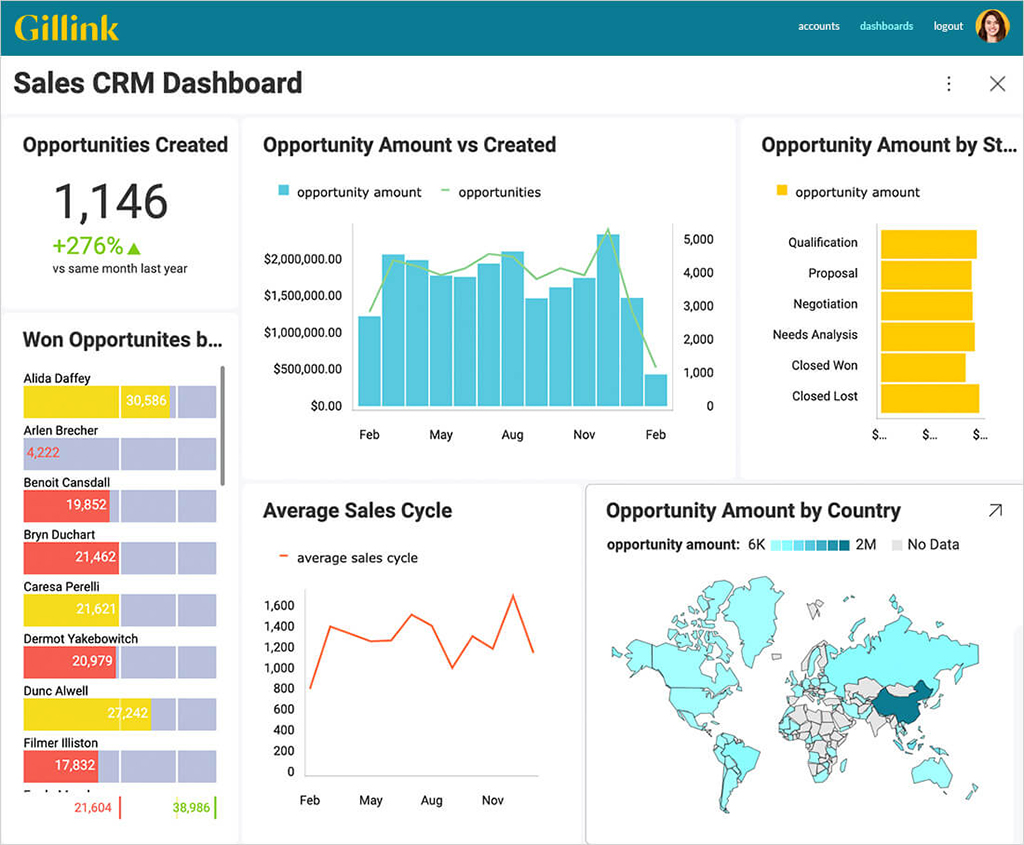
What Is an Embedded Dashboard?
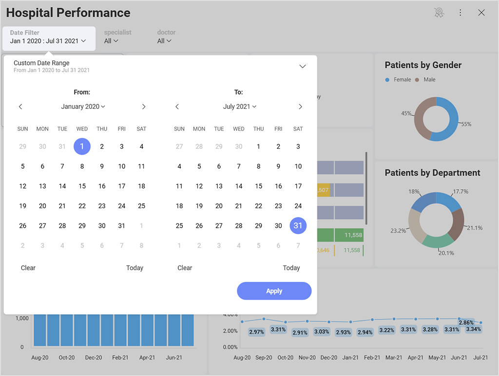
Dashboards are powerful tools to influence users’ decision-making processes. They help users get at-a-glance information on their most important KPIs and metrics and display relevant and actionable data. Embedded dashboards are screens that display data and data insights within existing applications that they have been integrated into. The embedded dashboard can be static, but a good embedded analytics solution offers interactive experiences allowing users to go beyond simply viewing.
Also, modern embedded analytics software offers functionalities such as dashboard linking, dynamic filtering, drill-down, and more that make it easy to create interactions to allow users to slice and dice data to gain deeper insights into the questions they want to answer.
Embedded Dashboards Common Visualizations
One of the most common embedded analytics challenges for users is that they allow themselves to be influenced by the way they previously interacted with data. Picking out the right chart type to visualize the data for your audience shouldn’t be a roadblock.
There is an infinite amount of chart types to choose from, and each one has unique attributes that can help you best get your message or data story across.
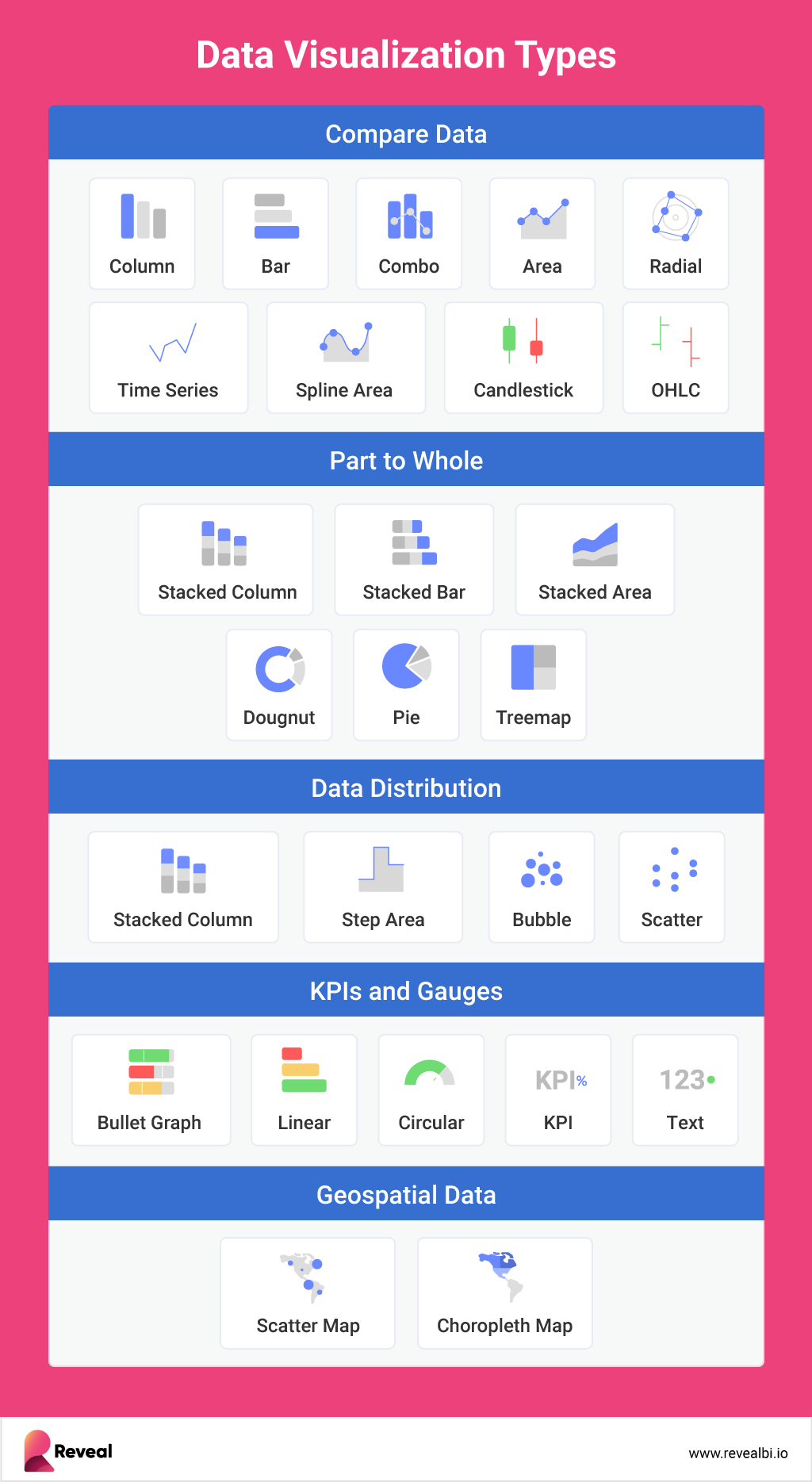
Infographics, for example, are an extremely common form of data visualization. Online marketers and content producers often use this popular type of data visualization to quickly convey information. Components of infographics typically include bar and line graphs, pie charts, and even color-coded maps.
Here are other common embedded dashboards data visualizations:
Dashboards
Dashboards are an organizational way to tell the story of your insights. Dashboards, which can typically be customized to fit the needs of various companies, departments, or teams, deliver important business intelligence reporting functions to the screens of managers and other business decision-makers. Often, the data displayed in charts and graphs on a dashboard is real-time or at least up-to-date, which lets people keep an eye on processes throughout the day. Unlike infographics, which are usually static, dashboards may come with some built-in data analysis tools. They may allow the user to tap or click to delve more deeply into metrics or see different views of the same data visualization story.
Charts and Graphs
Charts and graphs are typically the first data visualization types considered when creating a dashboard. A line chart can tell the overall story of data trends over time faster than a narrative or numbers, and a bar chart can let the viewer quickly compare counts or performance among different categories. But lines and bars aren’t the only graphical tools in the data analytics and BI reporting toolbox. Here are some other charts and graphs that are used in embedded BI dashboards:
- Gantt charts provide a quick visualization of projects or processes across time. They’re a great way to discover where one process may run into or overlap with another and make predictions about (or see when) processes are running behind.
- Pie charts are a quick way to illustrate what factors are at play in a process. Various versions of pie charts are good if you need to see whether each part of the whole is pulling its weight or if you want to see what factors are most important in a process or outcome.
- Treemap charts show hierarchical data using nested nodes (rectangles) of varying sizes and colors, making it easy to spot data patterns or compare data quantities. The treemap chart visualization doesn’t solve the same problem that a visualization like a bar chart or a line chart would but is instead meant for a more complex, richer data display.
- Histograms are statistical tools that help in drawing probability conclusions and show the distribution of your data. As a visualization tool, they can quickly demonstrate whether a process is hovering around the right mean or whether outliers are skewing results for data or outcomes.
- Scatter or dot plots use dots to provide a visual indication of every data point being considered. These let you see potential trends, outliers, and groupings.
- Box-and-whisker plots are a great way to quickly see whether there are outliers dragging a process up or down.
Tables
When you want to accompany your visuals with a more specific look at the data behind them, tables are typically the best way to display that information. That’s partly because everyone knows how to read tables’ column and row structures.
You might include tables in your data visualization reports when you know stakeholders will want to see more granular information. You can also include them if you want to specifically point out how one piece of data is skewing the conclusions that might be drawn from a chart.
When data analytics are embedded into software, they often come with options for viewing tables. For example, if someone can see a bar chart on their dashboard, they may be able to click on it to see the table and data behind it. This can be helpful if the bar chart seems concerning and the manager of the process would like additional information before acting.
Maps
Maps are an ideal way to display data that are linked to a specific location. Which states do you ship to most? Which neighborhoods have the oldest houses and thus might need certain types of services? Where in your facility are temperatures the coolest? These are all questions that might be best answered with map-type data visualization.
Embedded Dashboards Features to Look for
An embedded dashboard is where you can find your most important business insights and KPIs, so requiring more than static visualizations is important. Here are what features and functionalities to look for in embedded BI dashboards:
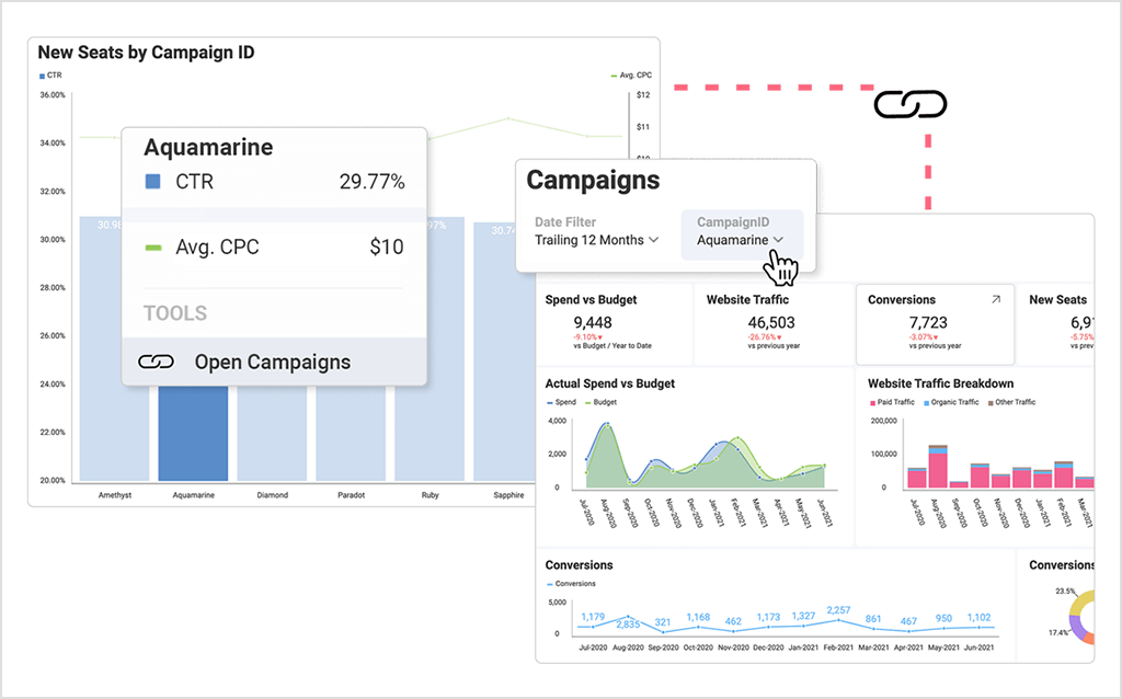
Dashboard linking – link data points or visualizations to other dashboards.
Data blending – merge multiple data sources together into one comprehensive visualization/dashboard for a side-by-side view.
Dynamic filtering – adding filters to your dashboard or visualization allows you to pivot your data on the fly to gain deeper insights. Provide either at the dashboard level or visualization level to give different options for your users to slice and dice data either by category fields or date ranges.
Drill down – enabling hierarchies within your category or date fields allows your end-users to do deeper analysis.
Customization (white labeling) – the ability to embed reports, dashboards, and data visualizations to match your own unique application’s fonts, colors, and overall brand theme. White-label analytics allows users to customize all UI elements (theming & styling, roundness vs squareness, dialogs, etc.) to match their organization’s brand perfectly.
Drag and drop (self-service) – enable technical and non-technical users alike to easily access and analyze data and build dashboards and custom reports through a visual, drag-and-drop interface (UI).
Embeddability – the ability to embed dashboards and visualizations in context, wherever they’re most relevant.
Sharing – users should be able to share and build upon one another’s work.
Security– in the context of dashboards, a security feature you should be looking for is a role-based permission functionality for easy governance.
How to Create High-Impact Dashboards?
High-impact dashboards can be a daunting thing to design. Especially if you don’t know where to start. But the goal becomes easily achievable if you follow dashboard design best practices. To ensure you design a modern UI/UX for your dashboard, read our detailed blog post on creating high-impact dashboards with embedded analytics.
Harness the Power of Data
Grow your business with real-time, contextual data.
How to Use Reveal Embedded Dashboards?
If you are not familiar with creating embedded dashboards, it can be a little overwhelming trying to figure out how to connect to all the data you have in different systems and build a dashboard to bring all your data together into a full 360-degree view of your business.
Reveal is self-service business intelligence software enabling you to visualize your significant business metrics, like marketing performance, monitoring operational trends, and KPIs, and optimizing customer portfolios, in one centralized location.
To show you how to achieve let’s quickly walk you through the steps of creating your own embedded BI dashboard in Reveal:
1. Access the dashboard creator menu
You can create a dashboard by clicking/tapping on the + Dashboard or Create Dashboard (My Analytics) blue button. This will prompt the New Visualization dialog. Proceed to create a visualization using a data source.
2. Add a data source
If your data source is not in the data sources list, select the + Data Source button in the top right-hand corner. A new dialog will appear, displaying all data source categories and available data sources. Feel free to scroll up and down until you see the data source you need. If your data source is a spreadsheet in a content manager, you can select, for example, the specific sheet you want to use in your visualization.
3. Available content
With Reveal, you can add many content sources, including Dropbox, OneDrive, Box, and Google Drive, allowing you to browse any folders, files, or spreadsheets available. In addition, you can also add SharePoint data sources, which means the ability to access any lists or libraries.
4. Changing your visualization
Once your data source has been added, you will be taken to the Visualizations Editor.
By default, the Column visualization will be selected. Reveal provides several options to customize the way your information is visualized; you can access the options by selecting the grid icon in the top bar.
Add labels and values to your visualization and preview them in the right-hand pane. If necessary, you can change your visualization settings or add filters to it.
Once you have modified the visualization, you will be taken back to the Dashboard Editor. You will see Undo, Redo, and the +Visualization split button in the top right-hand corner. Next to these buttons, you will also find the overflow menu of the dashboard where you can choose to change the dashboard theme, switch on/off Auto Layout, export, or save the dashboard.
You can also use the overflow menu in the top right corner of the visualizations to rename, edit, copy or duplicate them.
The difference between copying and duplicating a visualization is that duplicating works only inside the same dashboard, and the copy option allows you to put the visualization in the same or a different dashboard.
After copying a visualization, find the Paste option inside the overflow menu of the dashboard you want to paste the visualization in.
5. Applying a theme
Once you have continued to your dashboard, you can select the overflow menu ⇒ Theme and switch between Mountain Theme and Ocean Theme, as shown below.
6. Save the dashboard
Once your dashboard is ready, save it by selecting the tick icon in the top right-hand corner or accessing the Save As option in the overflow menu.
You can save your dashboard under My Analytics>My Dashboards or choose any of the workspaces you have joined or created.
Select a name for your dashboard, and when ready, click/tap Save here.
To better organize your space, you can create lists and sections by clicking on the +List and +Section buttons at the top right-hand corner while in the Save as menu.

