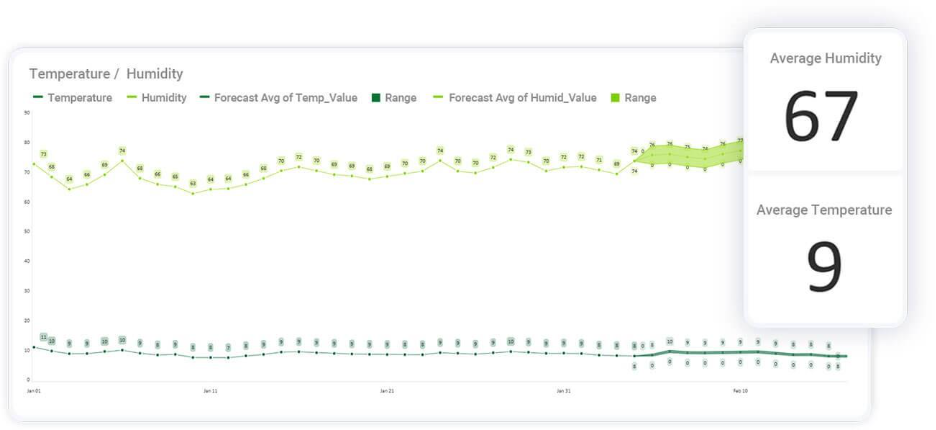
Scriptly Helps Pharmacies Identify Trends in Real Time with Reveal
Explore the complete guide to embedded analytics, including architecture, security, AI capabilities, implementation patterns, and evaluation criteria for modern applications.
Read NowFully branded white label dashboards offer custom personalization so that your customers can present a holistic service that is all branded to one company.
Read NowAprenda por qué las visualizaciones de datos DIY se están convirtiendo en la norma en productos SaaS e ISV. Comprenda los beneficios y cómo obtenerlos para su producto.
Executive Summary:
Key Takeaways:
Los paneles rígidos ralentizan a los equipos. Repiten los mismos gráficos limitados, sin importar el contexto empresarial. Los usuarios abandonan su producto para exportar datos a Excel o Tableau. Los desarrolladores se ahogan en solicitudes puntuales. Los líderes luchan por ver información que se ajuste a sus flujos de trabajo.
Estos problemas cuestan a las empresas SaaS adopción y retención. Cuando la analítica se siente genérica, los usuarios dejan de interactuar con ella. Cuando abandonan su aplicación en busca de respuestas, su producto pierde su capacidad de retención (stickiness). Y cuando los desarrolladores dedican tiempo a informes, su hoja de ruta se ralentiza.
Las visualizaciones de datos DIY (Do It Yourself) solucionan estos problemas. Mantienen la analítica dentro del producto y hacen que cada gráfico sea relevante para el contexto empresarial. Las visualizaciones de datos personalizadas se adaptan a los flujos de trabajo, los KPI y los casos de uso, impulsando la confianza del usuario y la adopción a largo plazo. Los líderes SaaS ven decisiones más rápidas, clientes más felices y una posición competitiva más fuerte.
El valor estratégico reside en resolver estos desafíos exactos, y ahí es donde las visualizaciones personalizadas comienzan a destacar.
Los paneles genéricos se ven iguales en todas partes. Rara vez responden a las preguntas exactas que tienen sus clientes. Esto limita la adopción y debilita el valor del producto. Los líderes SaaS no pueden permitirse eso, porque una analítica débil ralentiza la adopción, reduce la retención y dificulta la diferenciación de los productos.
Las visualizaciones de datos DIY cambian la ecuación. Se adaptan a los flujos de trabajo, los KPI y las necesidades del cliente, haciendo de la analítica una parte clave de la experiencia del producto en lugar de un complemento genérico.
Según investigaciones recientes, 81% de líderes tecnológicos vieron una mayor demanda de inteligencia de negocios y analítica integrada en 2024. Se proyecta que el mercado de analítica integrada alcance$55.54 billion by 2030. Estos números demuestran que la analítica flexible es ahora una capacidad central.
Las visualizaciones DIY son más fuertes cuando se combinan con analítica integrada. Esto coloca la información dentro del flujo de trabajo, en lugar de obligar a los usuarios a utilizar herramientas separadas.
Cuando la analítica se siente relevante, los usuarios realmente la utilizan.
Los paneles adaptados responden a las preguntas que más les importan a los clientes.
La información contextual genera confianza y fomenta la participación repetida.
Una mejor analítica mantiene a los usuarios dentro del producto, mejorando la retención.
Los productos SaaS compiten en funciones, pero la analítica puede ser un diferenciador duradero.
Las visualizaciones de datos personalizadas resaltan flujos de trabajo y métricas únicas.
Los competidores con paneles rígidos no pueden igualar esta flexibilidad.
La analítica se convierte en una característica que distingue su producto, no una que lo arrastra hacia abajo.
El tiempo del desarrollador es un recurso escaso.
Sin opciones de visualización DIY, los desarrolladores manejan constantes solicitudes de informes.
Con autoservicio, esas solicitudes disminuyen, dando espacio a la hoja de ruta para avanzar.
Una entrega de funciones más rápida fortalece su posición competitiva.
El valor estratégico se manifiesta en un impacto empresarial medible.
La narración de datos alinea a equipos y clientes con narrativas claras.
Una mejor adopción significa un mayor ROI en su inversión en el producto.
Los paneles interactivos ayudan a los líderes empresariales a tomar decisiones más rápidas e informadas.
El valor es claro a un nivel alto, pero el impacto es aún más obvio cuando examina cómo las visualizaciones DIY abordan los desafíos cotidianos que enfrentan los equipos de producto.
El valor estratégico se vuelve real cuando resuelve desafíos cotidianos. Las visualizaciones de datos DIY abordan los puntos de dolor más comunes que enfrentan los equipos de producto, desde paneles rígidos hasta recursos de desarrolladores desperdiciados.
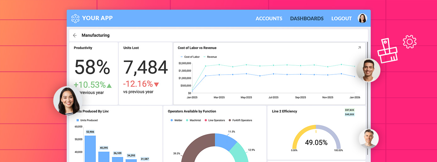
Los paneles rígidos no se adaptan a flujos de trabajo únicos. Obligan a cada usuario a seguir la misma estructura, independientemente de sus necesidades. Esto debilita la adopción porque los equipos no pueden alinear los elementos visuales con su flujo de trabajo real.
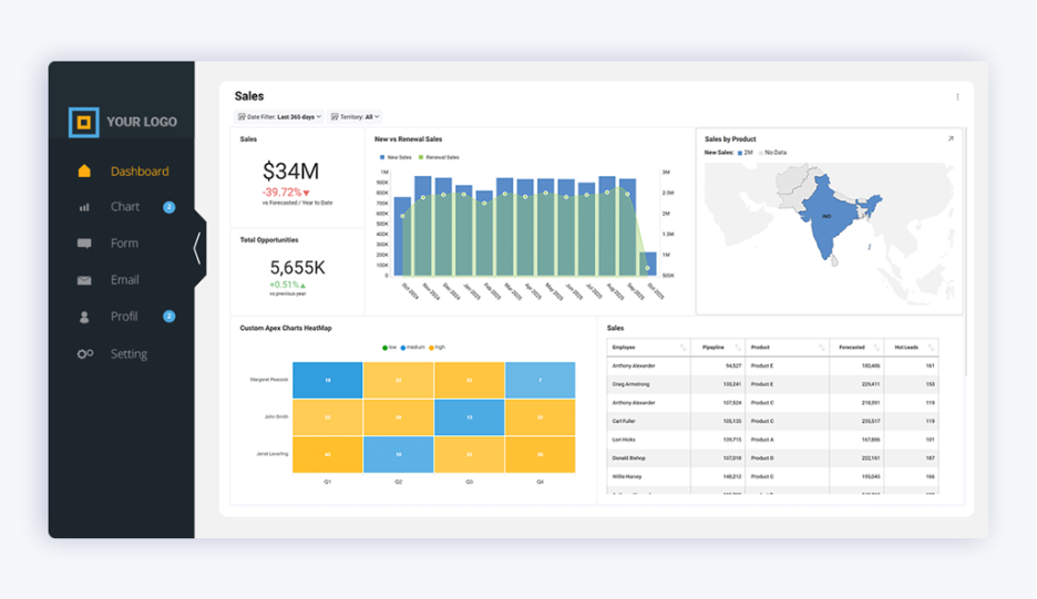
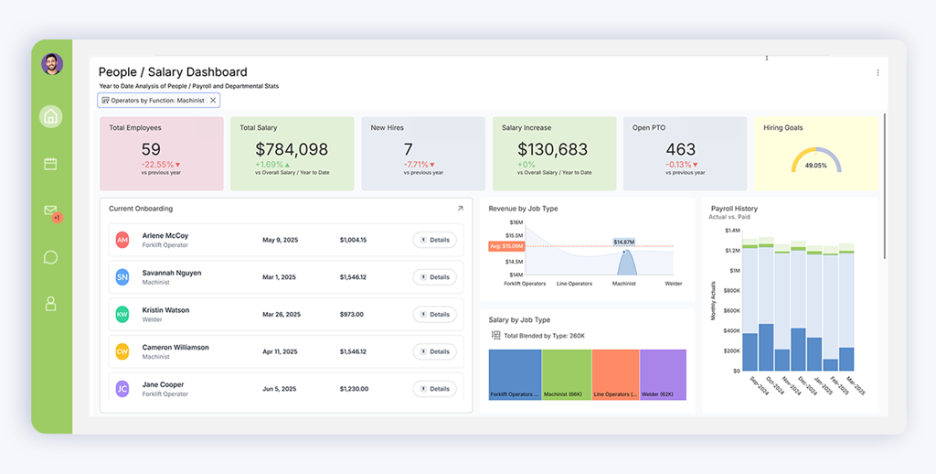
Las visualizaciones de datos DIY solucionan esto permitiendo paneles adaptados. Cada gráfico puede reflejar los KPI y flujos de trabajo específicos de su producto. Esto hace que la analítica sea significativa, no genérica, y mantiene a los usuarios comprometidos.
Cuando la analítica carece de flexibilidad, los desarrolladores se convierten en equipos de informes. Dedican horas a crear gráficos ad hoc en lugar de centrarse en las funciones del producto. Esto ralentiza la entrega de la hoja de ruta y aumenta la frustración.
Con visualizaciones de datos personalizadas, los usuarios pueden explorar y editar paneles de forma independiente. Los desarrolladores recuperan tiempo, mientras que los usuarios obtienen respuestas más rápido. 42% de las organizaciones enumeran recursos tecnológicos limitados como su principal desafío con la analítica. El autoservicio resuelve esto directamente.
Cuando los paneles no cumplen, los usuarios exportan datos a hojas de cálculo o herramientas externas. Esto malgasta tiempo, crea riesgos de seguridad y reduce la adopción de su producto.
Las visualizaciones de datos DIY mantienen el análisis dentro de la aplicación. Al conectarse directamente a fuentes de datos en vivo, los usuarios siempre trabajan con información actual y consistente. La investigación muestra que 61% de las organizaciones manejan cuatro o más herramientas de BI, perdiendo hasta un 40% de la productividad del analista. Los enfoques integrados eliminan este desperdicio.
Los elementos visuales genéricos no persuaden a los responsables de la toma de decisiones. Proporcionan información, pero no logran transmitir su impacto. Esta brecha obstaculiza la toma de decisiones y socava el compromiso de las partes interesadas.
Con visualizaciones de datos personalizadas, los equipos moldean narrativas que resuenan con su audiencia. Una mejor narración de datos ayuda a los líderes y clientes a ver el contexto, no solo los números. Esto aumenta la confianza en el producto y mejora la velocidad de decisión.
Estas soluciones dejan claro que las herramientas genéricas no pueden competir con la flexibilidad de un enfoque DIY, lo que plantea la pregunta de qué diferencia realmente a las visualizaciones personalizadas de las opciones preconstruidas.
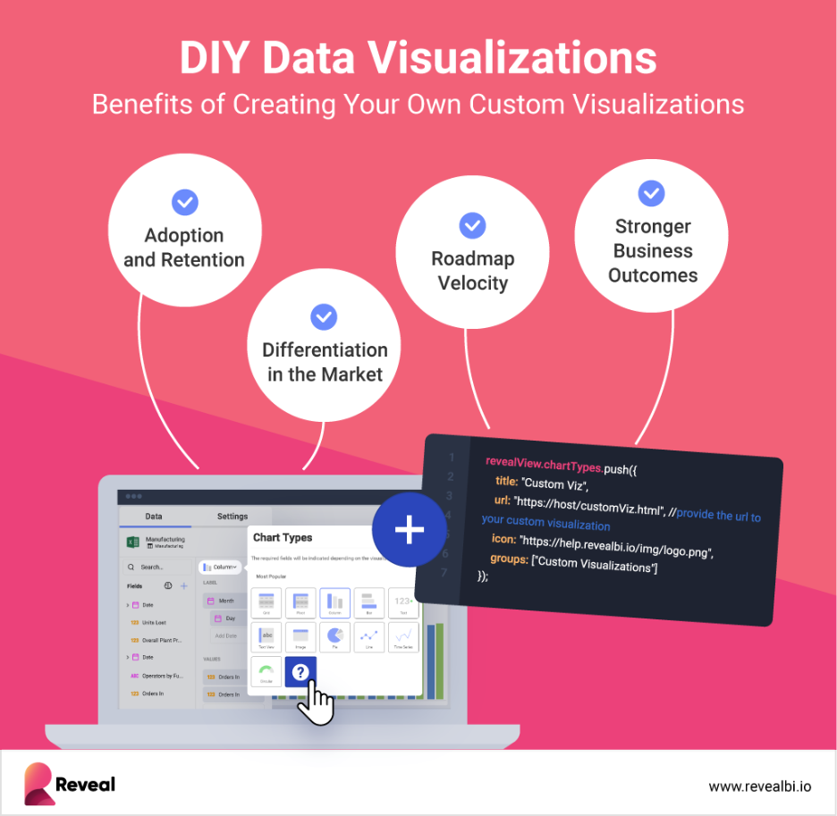
Las bibliotecas de gráficos preconstruidas ofrecen velocidad, pero poca flexibilidad. Las visualizaciones de datos DIY van más allá, dando a los productos SaaS el control y la profundidad necesarios para ofrecer analítica que realmente se ajuste a sus usuarios.
Las bibliotecas de gráficos vienen con plantillas fijas. Se ven iguales en todas partes y obligan a los usuarios a seguir patrones rígidos. Con visualizaciones de datos personalizadas, los equipos deciden cómo deben mostrarse las métricas. Cada gráfico y panel puede adaptarse al flujo de trabajo y a la audiencia.
Las soluciones DIY soportan más que elementos visuales estáticos.
Gráficos avanzados que van más allá de las barras y líneas básicas
Paneles interactivos que permiten filtrar, segmentar y profundizar (drilldowns)
Diseños responsivos que se adaptan a cualquier dispositivo o pantalla
Este nivel de control permite a los líderes SaaS ofrecer analítica que se integra perfectamente en el producto, en lugar de ser una capa desconectada.
La flexibilidad también significa estar listos para la próxima ola de analítica. La investigación indica que en 2025, 90% de los usuarios de analítica pasarán a ser creadores de contenido a través de herramientas impulsadas por IA, y las basadas en contexto reemplazarán 60% de los modelos de datos tradicionales.
Con analítica impulsada por IA, los usuarios pueden identificar tendencias, generar elementos visuales automáticamente y descubrir información más rápido. Esto cambia la analítica de informes reactivos a soporte proactivo de decisiones.
Por esto las visualizaciones de datos DIY destacan. Permite a los equipos combinar la creatividad humana con la velocidad de la IA, haciendo que la analítica sea más útil y más adoptada.
La flexibilidad es valiosa en sí misma, pero algunos escenarios de producto hacen que la visualización personalizada sea esencial en lugar de opcional.
No todos los escenarios exigen flexibilidad, pero algunos la hacen innegociable. En estos casos, las visualizaciones de datos DIY son la diferencia entre un producto que se usa a diario y uno que se ignora.
La adopción proviene de una analítica que se siente nativa del flujo de trabajo. Cuando los usuarios ven información en el momento adecuado, es más probable que regresen al producto.
Los paneles interactivos impulsan este comportamiento. Dan a los usuarios la libertad de filtrar, profundizar y adaptar las vistas sin salir de la aplicación. Los productos que ofrecen este tipo de compromiso ven una retención más fuerte y una lealtad a largo plazo.
Los mercados SaaS están saturados. Los paneles genéricos ya no destacan. Las visualizaciones de datos personalizadas resaltan las métricas y flujos de trabajo específicos que más le importan a sus clientes, dando a su producto una ventaja competitiva.
Un fuerte ejemplo es Commodity Centre. Integraron visualizaciones de datos DIY en su plataforma de logística, permitiendo a los usuarios rastrear operaciones en tiempo real. Esto no solo mejoró la eficiencia, sino que también construyó confianza y satisfacción del cliente.
La analítica no es solo una función; es un motor de ingresos. Con analítica blanca, las empresas SaaS pueden empaquetar paneles como niveles premium u opciones de venta adicional.
La investigación muestra que 31.4% de las organizaciones ya utilizan analítica integrada para generar mayores ingresos. Las visualizaciones de datos personalizadas hacen esto posible al ofrecer paneles que coinciden con la marca del cliente, no solo con la plantilla del proveedor.
La velocidad importa en los mercados competitivos. Los productos que ayudan a los usuarios a actuar rápidamente obtienen una ventaja. Las visualizaciones de datos DIY dan a los líderes información en contexto, en el momento en que se toman las decisiones.
20.2% de los clientes adoptan analítica integrada principalmente para mejorar la velocidad de toma de decisiones. Al mantener la información dentro del flujo de trabajo, las visualizaciones integradas eliminan el retraso causado por las exportaciones o las herramientas desconectadas.
Cumplir con estas necesidades requiere más que teoría. Depende de tecnología que pueda ofrecer visualizaciones DIY a escala.
Las visualizaciones de datos DIY solo aportan valor si la plataforma detrás de ellas puede escalar. Ahí es donde encaja Reveal.
Reveal fue construido para equipos SaaS que necesitan analítica integrada como parte de su producto. Proporciona:
Un SDK de analítica integrada con control total del desarrollador, sin iFrames
Paneles responsivos que se adaptan a cualquier dispositivo o interfaz
Personalización blanca completa para que la analítica coincida con la experiencia del producto
Herramientas de autoservicio para que los usuarios no técnicos puedan crear y editar sus propias vistas
Funciones impulsadas por IA que aportan flexibilidad e información con visión de futuro
Un modelo de precios transparente diseñado para un crecimiento predecible
Esta combinación permite a los líderes SaaS ofrecer visualizaciones de datos personalizadas sin ralentizar a los desarrolladores ni romper la hoja de ruta. De hecho, Reveal no es solo una herramienta de soporte, sino la base para tratar las visualizaciones DIY como una verdadera capacidad de producto.
Eche un vistazo a lo fácil que es crear una Visualización Personalizada DIY con Reveal:
Las visualizaciones de datos DIY hacen que la analítica sea flexible, relevante y parte de la experiencia del producto. Reveal permite este cambio con herramientas integradas que escalan, permitiendo a los equipos SaaS ofrecer valor más rápido y con menos esfuerzo.
Explore cómo Reveal apoya su producto con analítica que los usuarios confían y adoptan, reservando una demo personalizada.
Analítica Adaptada para Usted
Tome el control completo de su representación de datos con Reveal.