Scriptly Helps Pharmacies Identify Trends in Real Time with Reveal

Explore the complete guide to embedded analytics, including architecture, security, AI capabilities, implementation patterns, and evaluation criteria for modern applications.
Read Now
Fully branded white label dashboards offer custom personalization so that your customers can present a holistic service that is all branded to one company.
Read Now Reveal SDK 2.2.0 adds chart annotations, hyperlink columns across Grid, Pivot, Sparkline and DataGrid, and makes the redesigned tooltip the default.
Executive Summary:
Key Takeaways:
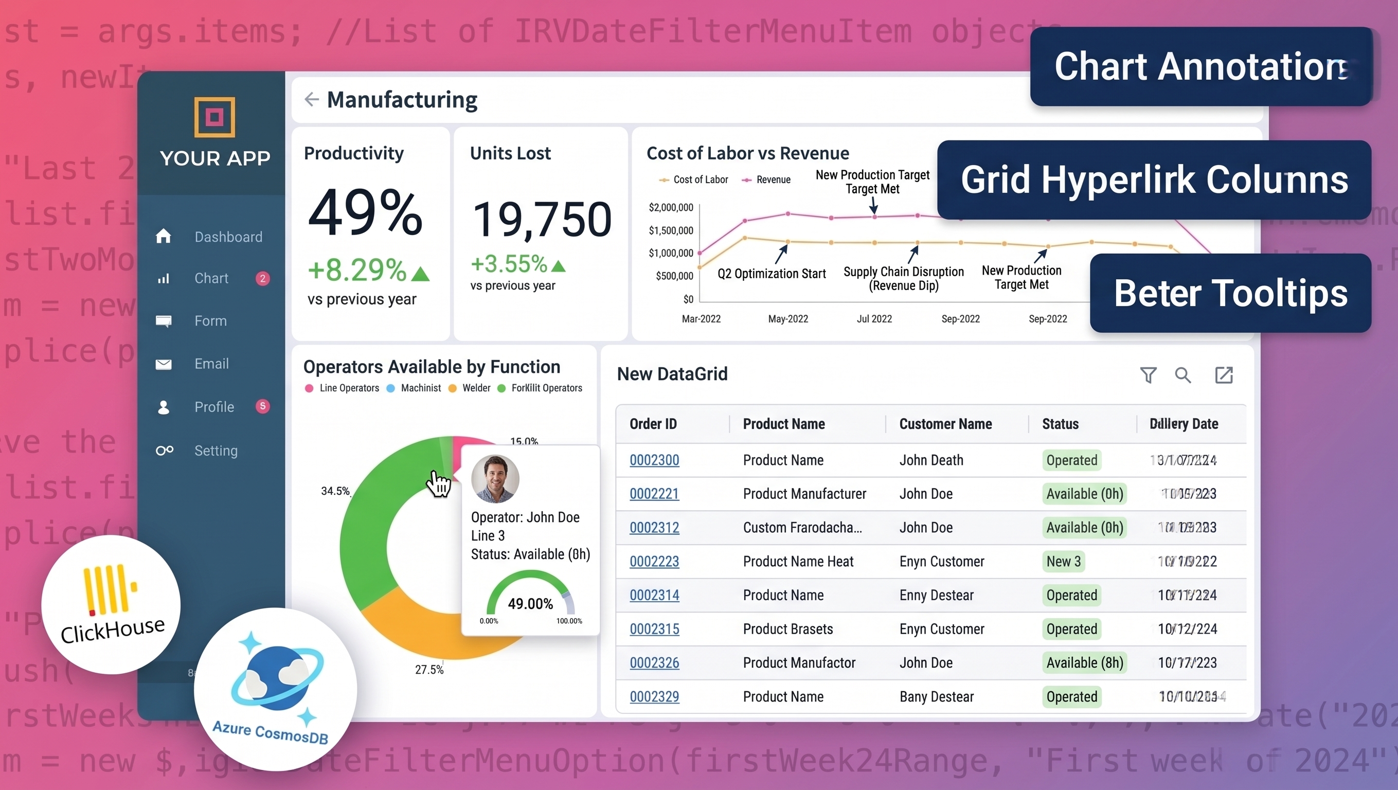
Reveal SDK 2.2.0 introduces chart annotations for providing more dashboards context directly on the visualization, hyperlink columns across four grid-style visualizations, and a better tooltip that graduates from beta to become the default.
Chart Annotations let you anchor a note to a data point, a category, or a range, and save it with the visualization so every viewer sees the same explanation in the same place. Hyperlink columns turn Grid, Pivot, Sparkline, and Data Grid cells into per-row links built from that row’s own data, with relative URLs now treated as first-class. The redesigned tooltip lands a large batch of fixes and is now on by default - the newTooltip beta flag is gone. On the data side, parameterized custom queries arrived for SQLite and DuckDB, PostgreSQL gained stored procedure support, and the AI layer now separates providers from profiles.
Before diving into these new capabilities, if this is your first time hearing about Reveal SDK, here’s why it belongs in your embedded analytics stack:
Now, let’s dive deep and explore what’s new in this Reveal SDK release, feature by feature.
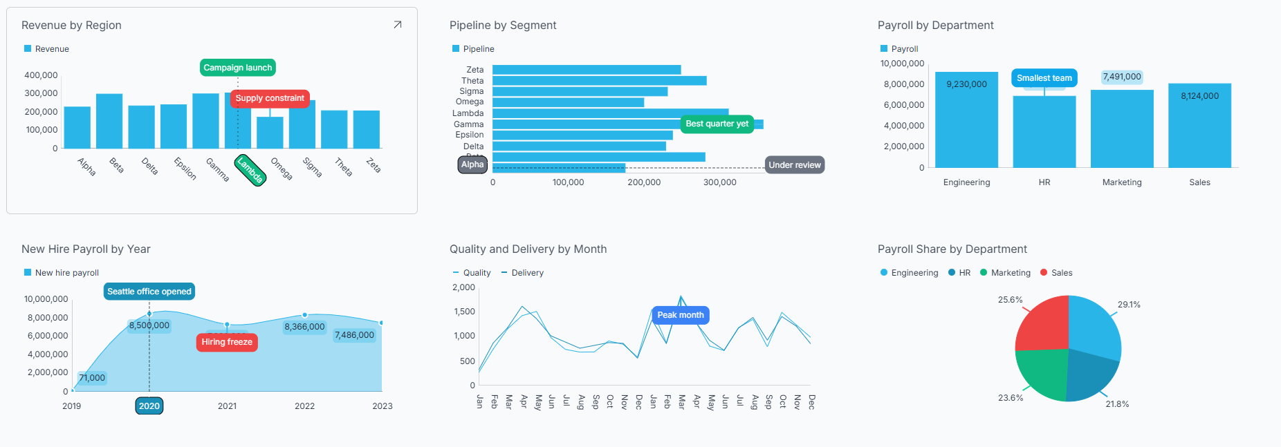
An annotation is a short note, just a title and an optional description anchored to a specific place on your chart. Once saved, it’s stored with the dashboard, and everyone who opens it sees the same note in the same place.
You turn on annotation mode with the Annotate button in the Visualization Editor toolbar, then place the note with one of three gestures. Reveal infers which kind of annotation you want from the gesture itself:
| Gesture | Type | What it marks |
|---|---|---|
| Click a data point | Point | One data point on one series - a single month’s value for a single measure |
| Click a category-axis label | Slice | One whole category, across every series in the chart |
| Drag across the plot area | Strip | A span of categories - a quarter, a promotion, an outage window |
Point annotations are for when the story is about one specific number. Slice and Strip are for when it’s about the period itself. There’s a nice bit of engineering in the Point case: when several series overlap where you clicked - easy to do on area and spline area charts - Reveal anchors to the series whose data point is closest to your click, not simply to whichever shape is drawn on top.
Annotation mode stays on after you save, so you can place several in a row.
The annotation dialog offers swatches drawn from your dashboard’s current theme, starting with a no color option and ending with a + that opens the full picker. The color becomes the annotation’s background, filling its label and card.
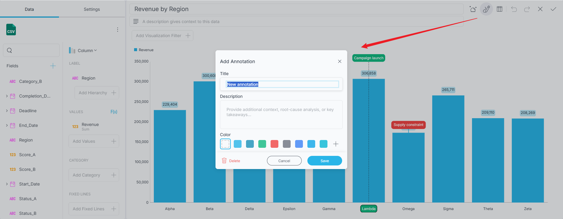
The detail that matters for theming: your chosen color survives a theme change, while everything else — text color, borders, spacing — derives from the active theme. Annotations restyle along with the dashboard without losing the emphasis you deliberately assigned.
Two constraints are worth knowing before you plan around this feature.
Stacked variants aren’t supported. Stacked Column, Stacked Bar, and their relatives are excluded by design - in a stacked chart each segment is drawn at an accumulated position rather than at its own value, so an annotation can’t be reliably anchored to the value you clicked. If a visualization doesn’t support annotations, the Annotate button is simply hidden.
There’s no programmatic API. Annotations are authored through the Visualization Editor, full stop. You cannot create or modify them from the SDK. If your use case is “generate annotations from an anomaly-detection service,” this release doesn’t cover it.
Slice and Strip annotations can only anchor to the category axis, not the value axis - a marker pinned to a number rather than a category would drift as the underlying data changes.
Now let’s have a look at the other release delighter.
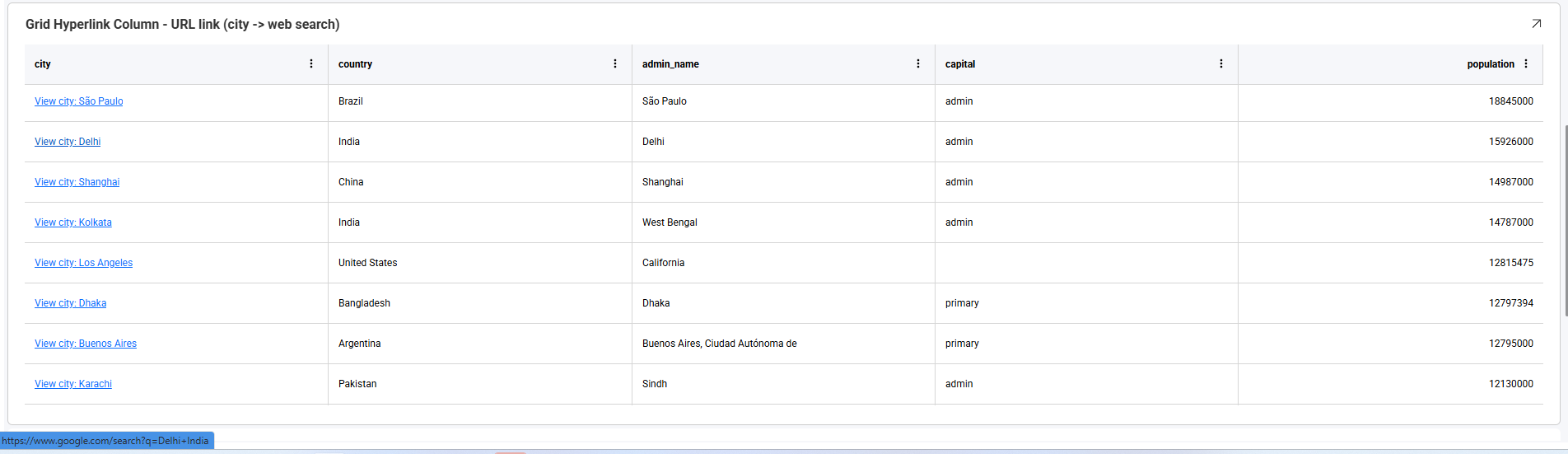
Hyperlink columns turn the values of a Grid, Pivot, Sparkline, or Data Grid column into clickable links. Because both the destination and the displayed text can include field tokens, every row gets its own destination built from that row’s data.
A token is a field name in square brackets, replaced at runtime with that field’s value for the clicked row:
https://www.example.com/orders/[OrderId]   →   https://www.example.com/orders/10248
https://www.example.com/search?customer=[CompanyName]
Values placed in the query string are URL-encoded automatically. Tokens work in the display text too - Order [OrderId] - [CompanyName] renders as Order 10248 - Alfreds Futterkiste. For a literal bracket, double it: [[ produces [.
Two behaviors are worth internalizing:
View Invoice [InvoiceId] label on a date column still sorts chronologically.Destinations don’t have to be absolute. Relative URLs let a hyperlink column point at a route inside the application hosting the Reveal view. When the URL field loses focus in the editor, the value is normalized:
| Entered | Normalized |
|---|---|
contact/[ContactId] | ./contact/[ContactId] |
/contact/[ContactId] | /contact/[ContactId] |
../contact/[ContactId] | ../contact/[ContactId] |
example.com/contact | http://example.com/contact |
Values beginning with /, ./, ../, ?, or # are explicit relative URLs and are preserved as-is. A bare host name gets a scheme matching the hosting page’s protocol, so an HTTPS page produces https://.
Only http, https, mailto, and tel are allowed. URLs containing backslashes, carriage returns, line feeds, or tabs are rejected. And one deployment caveat: relative URLs rely on the browser supplying a base URL, so they resolve only in the Web client.
The onUrlLinkRequested callback runs before navigation, which makes it the integration point for single-page applications. Returning a null or empty value cancels the default navigation - that’s how you route internally without a full page reload:
revealView.onUrlLinkRequested = (args) => {
    console.log(args.url);           // the resolved destination
    console.log(args.target);        // where the browser should open it
    console.log(args.visualization); // the visualization that was clicked
    console.log(args.cell);          // the clicked cell
    console.log(args.row);           // the entire clicked row


    // route app-relative links through the client-side router
    if (args.url.startsWith("./") || args.url.startsWith("/")) {
        router.navigate(args.url);
        return null; // cancels the default navigation
    }


    return args.url + "&source=reveal";
};
The same click context now reaches dashboard links. onLinkedDashboardProviderAsync receives an argument object carrying the originating visualization, the clicked cell, and the row - so your application can return a different dashboard, or one loaded with different data, depending on what the user actually clicked.

The headline is that the redesigned tooltip is no longer behind a flag. The more useful story is why it was ready to lose the flag: the bulk of the tooltip work in 2.2.0 was and enhancements. Positioning, anchoring, hover targeting, formatting, and the behavior of the actions inside the tooltip all got worked over, across every visualization type that shows one. If you tried the redesigned tooltip during beta and backed it out because something about it misbehaved, this is the release to try again - the specific issue you hit has a good chance of being on the fixed list in the 2.2.0 release notes.
What that stabilization adds up to: tooltips appear on hover for every visualization type that supports them - Charts, Pie, Funnel and Treemap, Maps, Grids, and Data Charts. They follow the cursor as it moves over the data; when the mouse momentarily stops, the tooltip anchors itself so you can reach the actions inside it. Drill down and filtering are available directly from the tooltip, without the extra click the old experience required.
With that behavior settled across the board, keeping it behind a flag stopped making sense. It is now the default.
This is the one breaking change that needs your attention. The newTooltip beta flag - and the BetaFeatures.newTooltips constant - have been removed:
// Delete this. The flag no longer exists.
RevealSdkSettings.betaFeatures.enable("newTooltip");
Use RevealView.showTooltips to turn tooltips on or off, and RevealView.onTooltipShowing to read tooltip data or suppress a tooltip conditionally.
The new DataGrid has been the faster, more capable grid you had to opt into. In 2.2.0 that flips: it is the default grid for the Reveal SDK.
Existing dashboards need no change. A Grid visualization saved years ago now renders with the DataGrid, picking up its rendering performance, column summaries, column pinning, and responsive layout on the way. The dashboard file itself is untouched - this is a rendering decision made by the SDK, not a migration of your content.
2.2.0 also adds interactive filtering to it, through a “Filter By” action on eligible cells.
The newDataGrid beta feature still exists - it has simply flipped from opt-in to opt-out. Disable it and grids render exactly as before:
RevealSdkSettings.betaFeatures.disable("newDataGrid");RVDashboard now round-trips through JSON:
const dashboard = RVDashboard.loadFromJson(json);
revealView.dashboard = dashboard;


const asObject = revealView.dashboard.toJson();
const asString = revealView.dashboard.toJsonString();
This opens up the workflows that need a dashboard as data rather than as a file - storing definitions in your own database, diffing them in version control, templating them per tenant, or generating them from a service and handing the result straight to a RevealView.
The connector work in 2.2.0 is less headline-grabbing than annotations, but several items unblock real scenarios:
applyTimeZone function.The AI stack got a structural change worth calling out even though it predates 2.2.0’s feature freeze.
Providers and profiles are now separate concepts. A provider holds credentials and endpoint details for an LLM service; a profile references a provider and specifies a model plus generation settings. Several profiles can share one provider connection - which means clients select a profile by name without ever seeing an API key or a model identifier.
IMetadataStorageProvider lets you move generated metadata off local JSON files. The interface is small - get, create, update, delete, list - and every operation receives an IRVUserContext, which is where the design gets interesting. During generation, Reveal runs as a built-in system user (reveal-ai-metadata-user), so that’s your cue to store the full metadata at whatever scope fits your application, commonly per tenant. During retrieval, the context is the actual requesting user, so that’s where you apply authorization and filter down to what that user may see:
public async Task<T?> GetByIdAsync<T>(string id, IRVUserContext userContext)
{
    var metadata = await _storage.GetAsync<T>(id);
    return await _permissions.CanReadAsync(userContext, id) ? metadata : default;
}
You can isolate metadata per user instead, but then anything shared by several users must be replicated - and every copy has to be updated on regeneration. Tenant-scoped storage with per-user filtering is usually the better trade.
One thing you may notice outside the SDK itself: the assistant on this documentation site now runs on our own Reveal AI plugin rather than a third-party service. Same for the Discord bot, where a lot of the real developer questions actually get asked.
There’s also a new Choosing a Model guide, backed by ongoing benchmarking. Its core insight: Reveal asks models to do two quite different jobs. Dashboard generation demands strictly structured JSON referencing real tables and fields - small formatting mistakes fail the whole result. Data insights has a simpler output format but more open-ended reasoning. A model that excels at one is not guaranteed to excel at the other.
The complete list - every feature, every fix, every breaking change - is in the 2.2.0 release notes.
For the three headline features, the documentation is new and worth reading rather than skimming:
showTooltips, and the onTooltipShowing eventIf you’re upgrading from 2.1.0, start with the breaking changes above. Search your codebase for newTooltip, delete what you find, and you’re most of the way there.


 Return to Blog

 ChatGPT
 Perplexity