Scriptly Helps Pharmacies Identify Trends in Real Time with Reveal

Explore the complete guide to embedded analytics, including architecture, security, AI capabilities, implementation patterns, and evaluation criteria for modern applications.
Read Now
Fully branded white label dashboards offer custom personalization so that your customers can present a holistic service that is all branded to one company.
Read Now The Data Grid became the default grid visualization in Reveal SDK 2.2.0. Here is everything it adds over the classic grid - a column options menu, filtering, summaries, grouping, pinning, multi-column sorting, cell copying and full theming.
Executive Summary:
Key Takeaways:
For the last few releases the Data Grid has been the grid you had to opt into. In Reveal SDK 2.2.0 that flipped: the Data Grid is the default grid visualization.
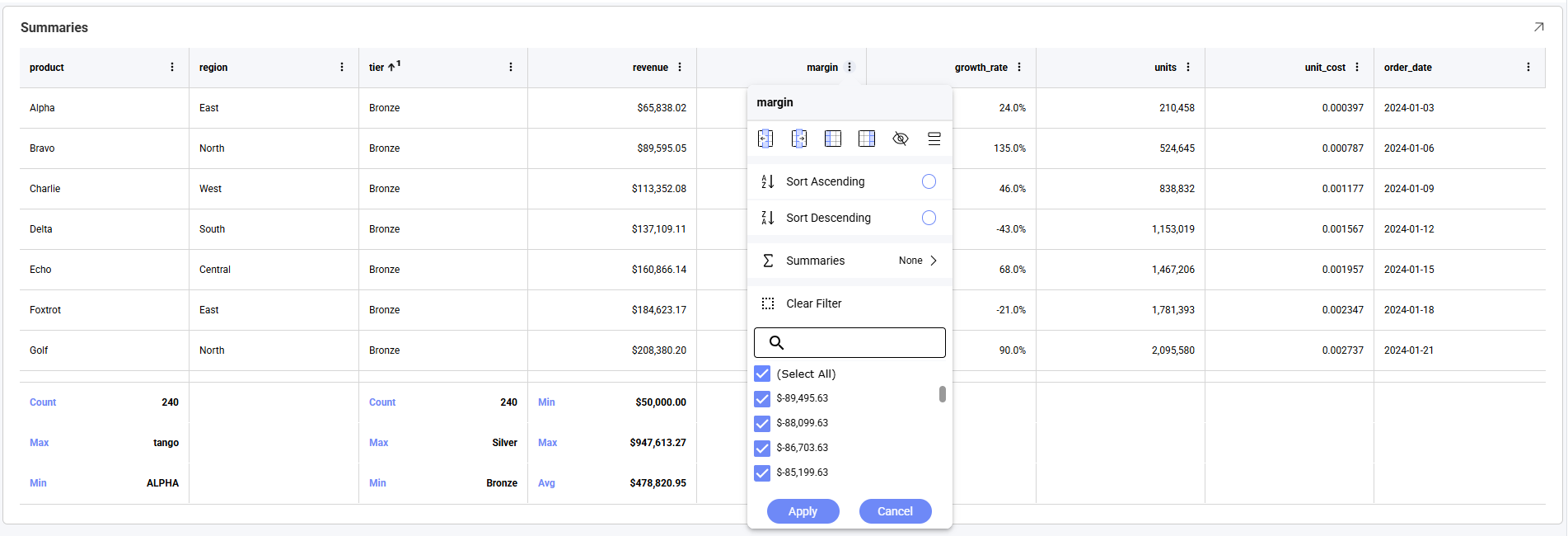
The important part of that sentence is what it doesn’t mean. This is not a new chart type, and it is not a migration. The same Grid visualization renders either as the classic grid or as the Data Grid, and which one you get is decided in the browser as the visualization is built. Dashboards authored years ago render with the Data Grid without being touched, and nothing inside the .rdash file changes.
If you turned on the newDataGrid feature flag during beta, none of this is new to you - you have been using exactly this grid all along. What changed is the default. Applications that never touched the flag now get the Data Grid too, which makes this a good moment to lay out, in one place, everything the Data Grid gives your end-users over the classic grid.
| Capability | What the end-user gets |
|---|---|
| Column options menu | A ⋮ button on every header, gathering sorting, filtering, summaries, grouping, pinning and column visibility in one place |
| Column filtering | Filter any column from its header, using a searchable checkbox list of that column’s values |
| Column summaries | Sum, average, count, minimum and maximum on numeric columns, in a summary row |
| Grouping | Collapsible group rows, nested to any depth |
| Column pinning | Freeze a column against the left or right edge while the grid scrolls |
| Resizing and reordering | Drag a header’s edge to resize, or its middle to move the column |
| Show / hide columns | Choose which columns are visible without editing the dashboard |
| Multi-column sorting | Sorting a second column adds to the sort, with a sort ordinal on each sorted header |
| Cell selection and copying | Click a cell or drag a range, then Ctrl+C to copy it as CSV |
| Theming | The grid follows the active Reveal theme across every surface, including the column menu |
The classic grid has none of it.
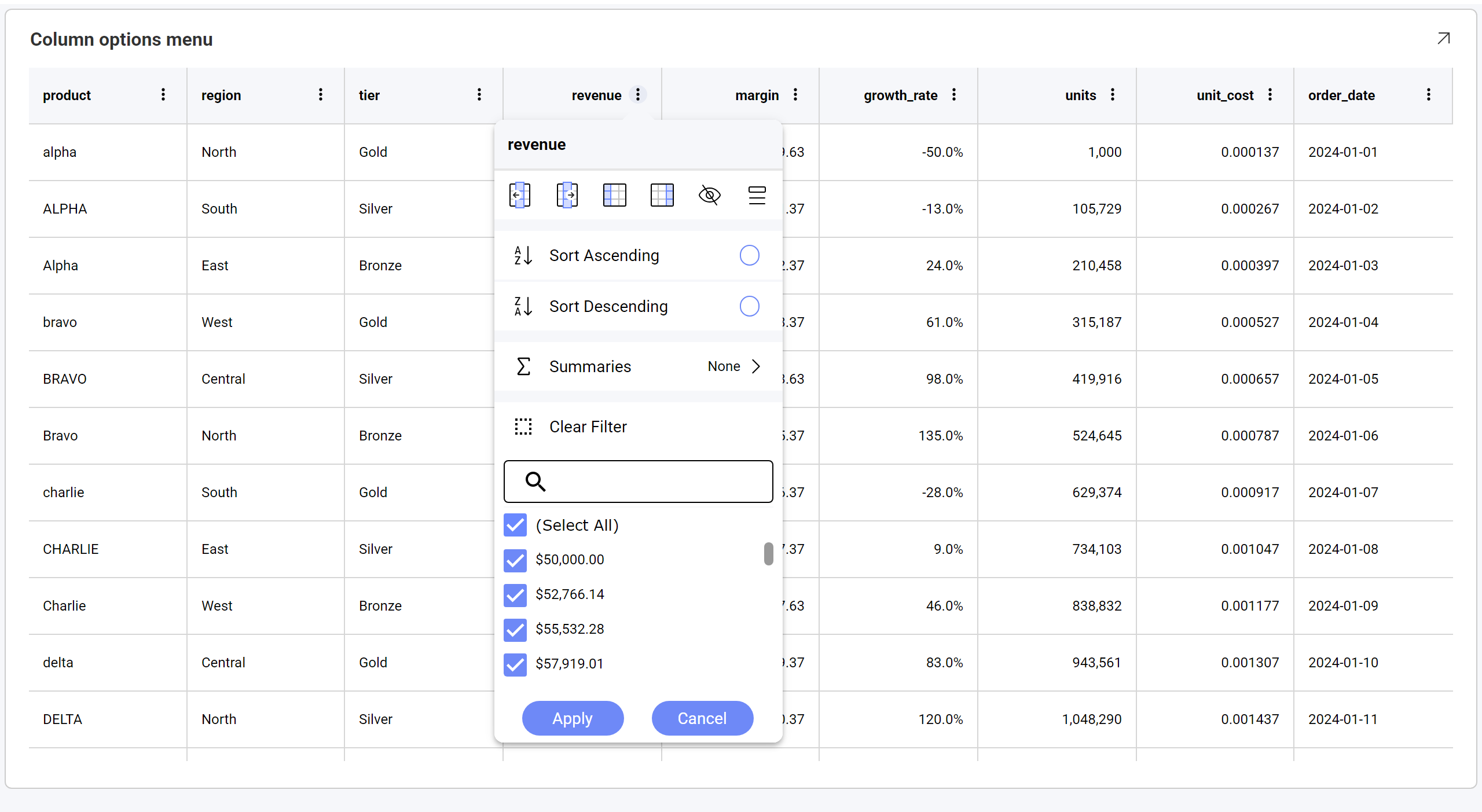
Everything above starts in the same place. Every column in the Data Grid carries a ⋮ button in its header, and it opens a menu that brings sorting, filtering, summaries, grouping, pinning and column visibility together.
Compare that with the classic grid, where headers offer sort arrows and nothing else - no menu, no filtering, no summaries:
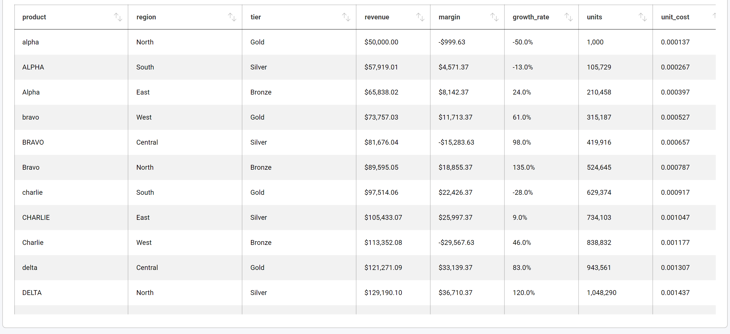
One small interaction difference worth knowing: clicking the header text sorts the column, and the menu opens only from the ⋮ button. In the classic grid, clicking a header selects the column instead.
Each column can be filtered from its own menu. The value list is built from that column’s distinct values and is searchable, which matters as soon as a column has more than a screenful of them. Toggle (Select All), clear what you want to exclude, and choose Apply.
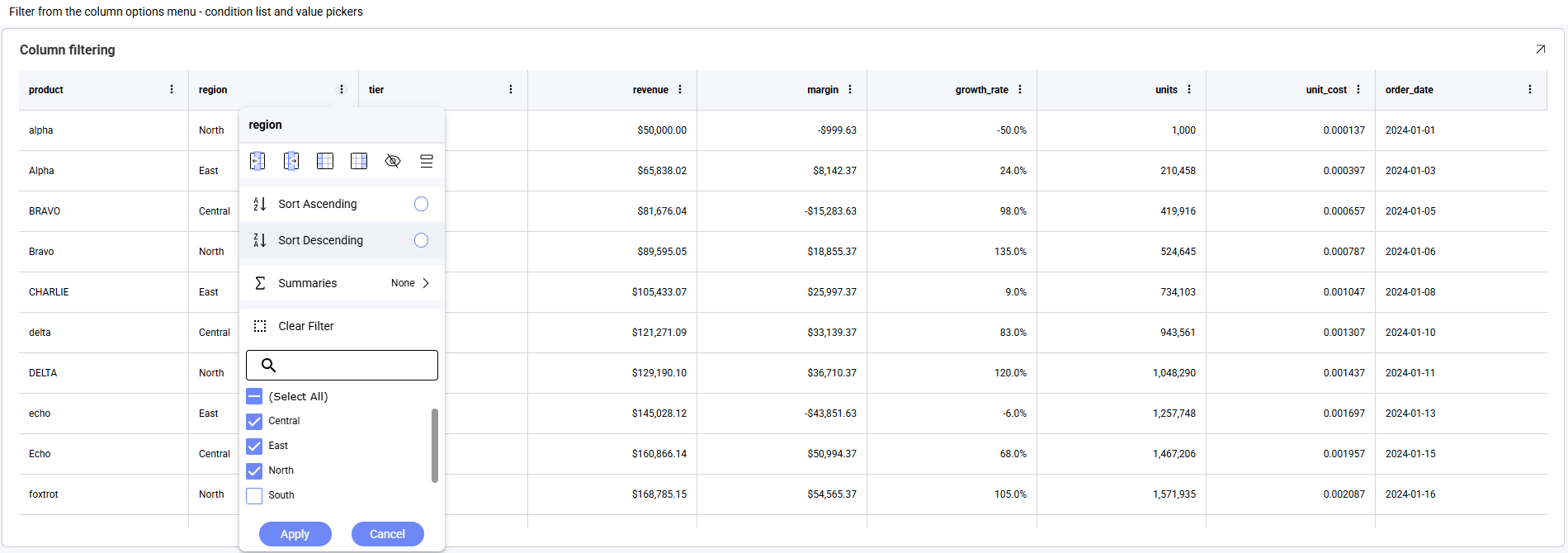
Filters on different columns combine, so filtering region and then tier narrows to the rows matching both, and Clear Filter removes the filter from just that column.
Two details that tend to come up in practice: values appear in the list formatted exactly as they appear in the cells - a currency column lists $50,000.00 rather than 50000 - while the filter itself matches on the underlying value. And column filtering applies in addition to any dashboard filters you already have. It doesn’t replace them; it gives the end-user a layer of their own.
In the classic grid, a grid could only ever be filtered through dashboard filters - which meant an end-user who wanted a narrower view had to ask whoever owned the dashboard.
Numeric columns can show an aggregate in a summary row. Open the column’s ⋮ menu and choose Summaries:
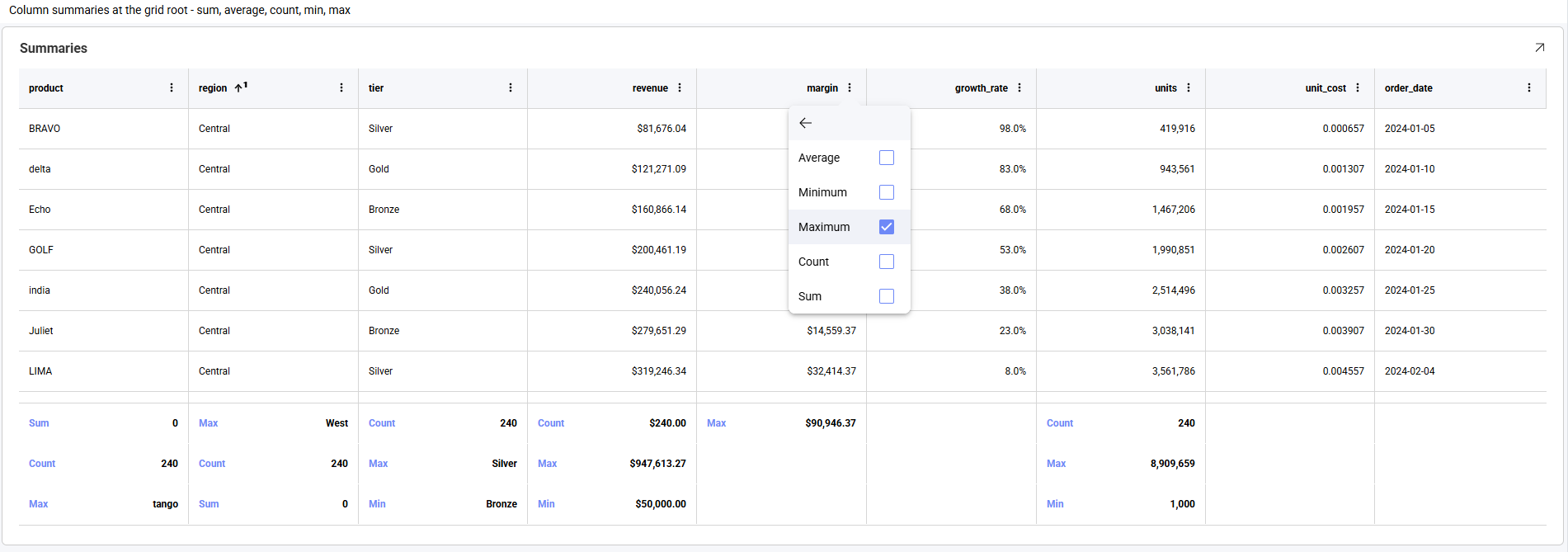
Five aggregates are available - Average, Minimum, Maximum, Count and Sum - and they are checkboxes rather than a single choice, so one column can show more than one at a time.
The Data Grid renders grouped rows - group from the column menu, or author Grouped Columns on the visualization in the editor. Grouping nests to more than one level, and each level expands and collapses independently.
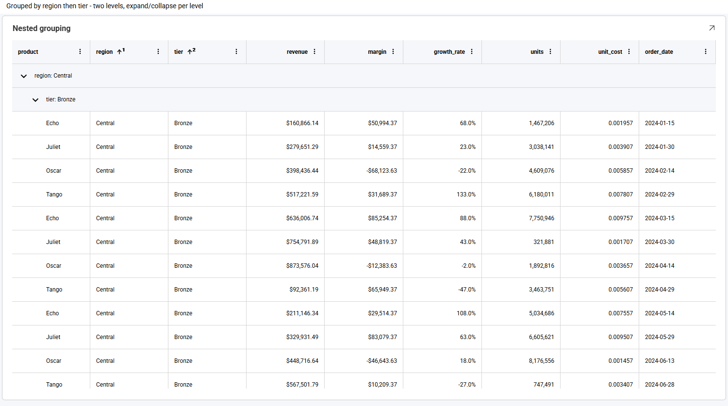
This is one of the places where the two grids diverge most sharply on the same dashboard file: the classic grid ignores a dashboard’s grouping configuration entirely and renders a flat table. If you have dashboards authored with grouping that never looked grouped, this release is when they start to.
Sorting a second column adds to the sort rather than replacing it, and each sorted header shows a superscript sort ordinal giving its position in the sort order.
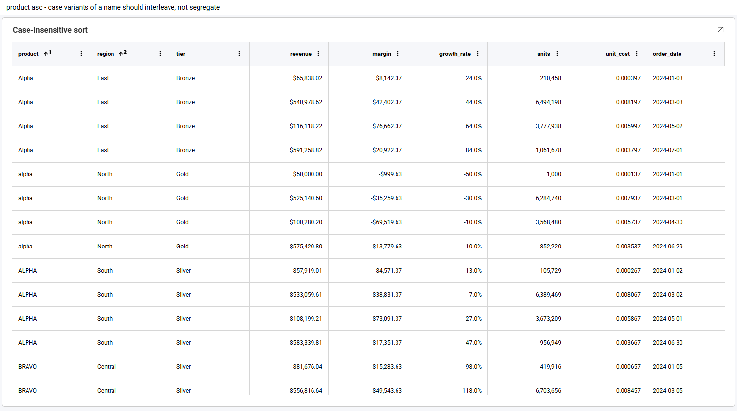
Here product ↑¹ sorts first and region ↑² second. Sorting is also case-insensitive, so Alpha, alpha and ALPHA sort together instead of splitting into upper- and lower-case blocks.
Clicking a cell selects it. Dragging across cells selects a rectangular range, highlighted with the anchor cell outlined.
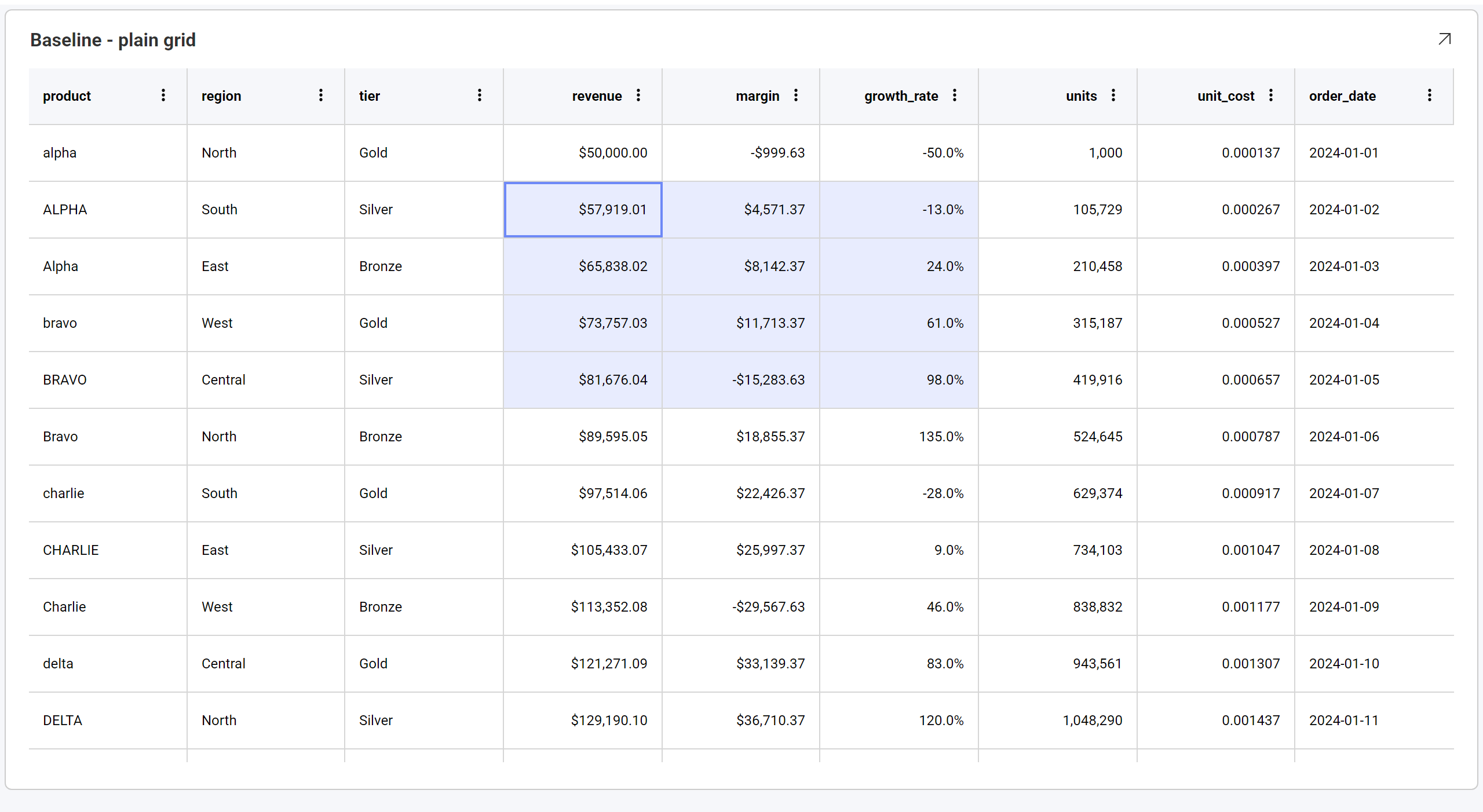
Press Ctrl+C (⌘+C on macOS) and the selection goes to the clipboard. A single cell copies as one value; a range copies as CSV, one line per row:
alpha,North,"$50,000.00",-50.0%,2024-01-01
ALPHA,South,"$57,919.01",-13.0%,2024-01-02
Alpha,East,"$65,838.02",24.0%,2024-01-03
Values are copied formatted, not raw - a currency cell copies as $50,000.00, matching what is on screen and consistent with the filter value list - and any value containing a comma is quoted, so the separator is never ambiguous. This is one of those features nobody requests in a feature review and everybody uses on day one.
The Data Grid follows the theme applied through RevealSdkSettings.theme. Header and cell backgrounds, text and separator colors, scrollbars, the selected-cell highlight, the summary row, and every part of the column options menu - including its tooltips - all derive from the active theme.
RevealSdkSettings.theme = new OceanDarkTheme();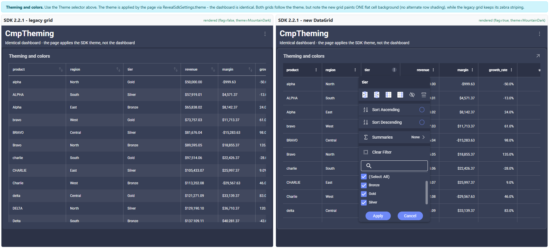
Custom themes work the same way. Two practical notes: set the theme before creating the RevealView, because the grid resolves theme colors as it renders; and remember the theme colors the visualization, not the page hosting it - apply theme.dashboardBackgroundColor to your own layout so a dark theme doesn’t render a dark grid on a light page.
Because the Data Grid is now the default, dashboards that previously rendered with the classic grid render differently today. Most of the change is additive, but two differences are purely visual and are the ones people notice first.
| Classic grid | Data Grid | |
|---|---|---|
| Numeric alignment | Left-aligned, like text | Right-aligned, so magnitudes line up |
| Row shading | Alternate row shading | Flat background with horizontal rules |
| Cell borders | Vertical and horizontal rules everywhere | Horizontal rules only, lighter weight |
| Row height | Denser | Taller, with more cell padding |
| Column widths | Fixed, and can overflow the visualization | Fitted to the available width, and resizable |
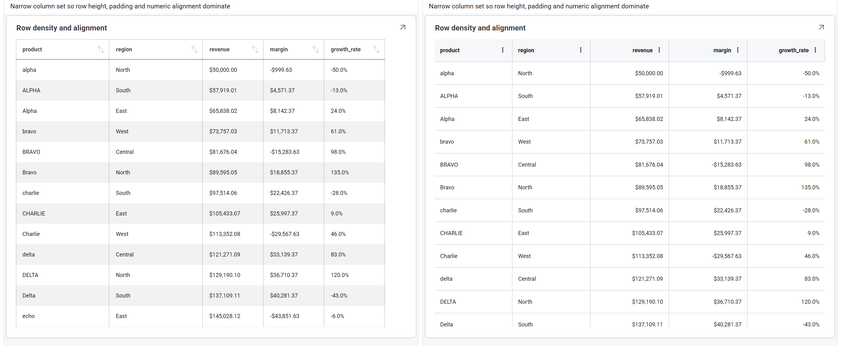
Right-aligned numbers are usually the first thing anyone comments on, and they’re worth mentioning before you roll out. Alternate row shading is the other: it is not currently available in the Data Grid, and there is no property to enable it.
That one is a deliberate decision rather than a missing feature. Alternate rows were intentionally disabled in the new grid because the feature conflicts with advanced capabilities such as grouping, cell merging and conditional formatting, which produced inconsistent visual behavior. The underlying code is still there - it is turned off pending a design that works consistently across all grid features.
There is also one behavioral change to check if you lean on conditional formatting: when several rules match the same cell, the Data Grid applies all of them in list order, with later rules winning for any overlapping properties. The classic grid behaved differently, so dashboards built around overlapping rules deserve a look after upgrading.
There is no per-feature switch, on the client or the server, and nothing to add to a .rdash file. The single newDataGrid feature selects which grid implementation renders, and everything above comes with it, configured by the SDK:
// Data Grid - the default from 2.2.0
RevealSdkSettings.betaFeatures.enable("newDataGrid");

// Classic grid - none of the features above
RevealSdkSettings.betaFeatures.disable("newDataGrid");
Since the Data Grid is the default, you need no code at all to use it. To go back to the classic grid, disable the feature during application start-up - before any RevealView is created, since the flag is read while a visualization is being constructed. Toggling it afterwards does not change a grid already on screen.
The trade-off of that simplicity is honest: there is currently no supported way to turn an individual feature off. You cannot keep the column menu but remove the filter section, or disable copying. The choice on offer is which grid renders.
What is yours to configure: the theme, the visualization’s overflow menu through onMenuOpening, tooltips, click handling through onVisualizationDataPointClicked, and everything authored on the dashboard itself - grouping, sorting, field formatting, renamed captions and hyperlink columns.
revealView.onVisualizationDataPointClicked = (visualization, cell, row) => {
    console.log(cell.columnName, cell.value, cell.formattedValue);
};The full walkthrough - every feature, the current limitations, and the exact differences between the two grids - is in the new Data Grid documentation topic. The Beta Features page covers the feature API, and the 2.2.0 release notes cover everything else that shipped alongside it.
If you are upgrading from an earlier version, the short checklist is: tell your users about right-aligned numbers and the missing row shading, check any dashboards that rely on overlapping conditional-formatting rules, and check any paged grids that were showing column summaries.


 Return to Blog

 ChatGPT
 Perplexity