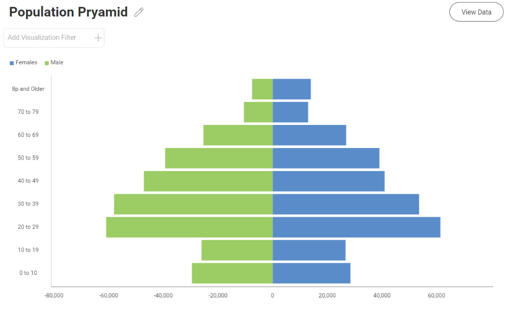
In this blog, I’m going to show you how to create a population pyramid chart that provides an attractive at-a-glance view of the demographics of a country, typically broken down by male/female, though it can be used for other demographics as well. Here’s what the final chart will look like:
Before diving into how you can create a population pyramid chart, let’s first review some of the basic chart types.
What are bar charts?
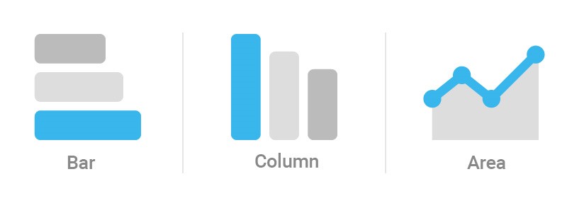
Let’s first start with some of the basic chart types before diving into a population pyramid chart specifically. Bar charts, similar to column and area charts, are mainly used for showing comparative data. The below example uses charts to show the variation between your different categories and is sorted in ascending order to make it clear for the end user.
What are stacked charts?
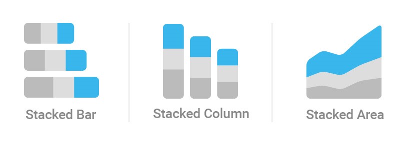
Stacked charts extend a typical bar, column or area chart by allowing you to display comparisons of different categorical data. This gives you the ability to compare parts of a whole within your data.
So why not use a bar chart instead?
You move into using a stacked column chart vs a bar chart when you want to see the total sum of all the variables along with breakdown of each variable.
What is a population pyramid chart?
Pyramid charts are popular visualizations when working with demographics as they are an easy way to show the age and male/female composition of a given country. While line charts are very common when describing the growth scale of any population, pyramid charts show any changes or significant differences.
How to create a population pyramid in Reveal
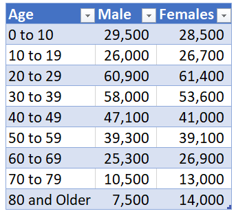
We are going to the following columns in an excel file to create our chart:
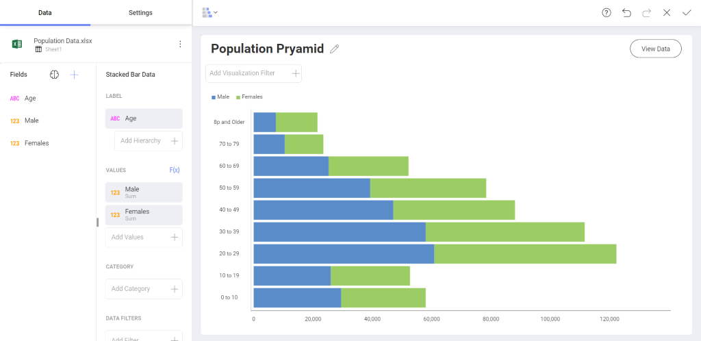
Next we will create a stacked bar chart like so:
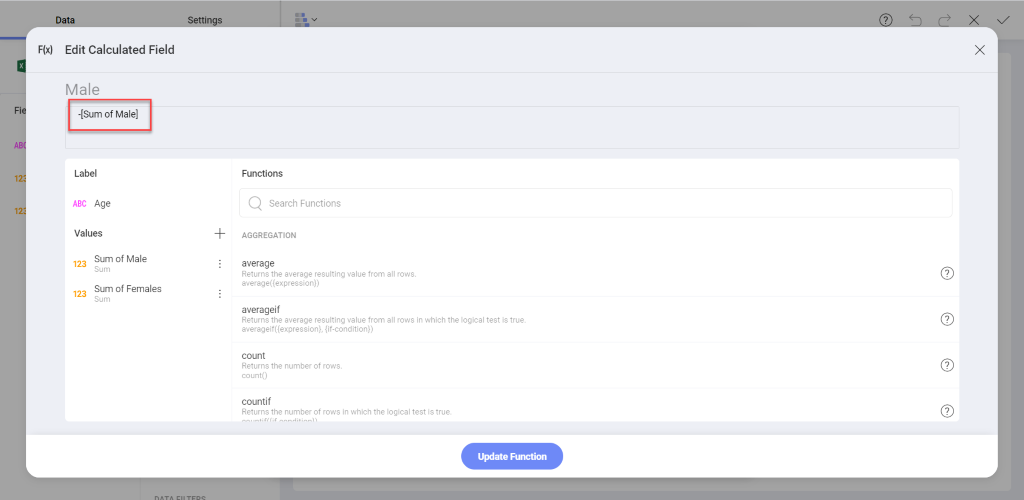
In order to create a pyramid we will create a calculated field so that the Male values point to the left. You can do this by clicking on the F(x) icon next to your values. Inside the calculated field we will type the following into the formular bar:
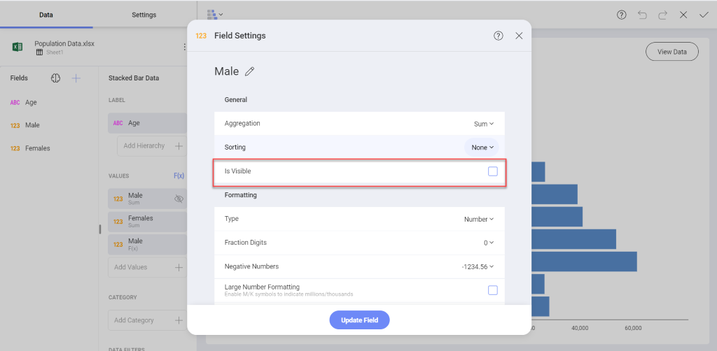
After you hit update function we will click the original male field and uncheck the is visible box:
The end result will be a population pyramid chart like the following:
Learn About Other Charts and Visualizations
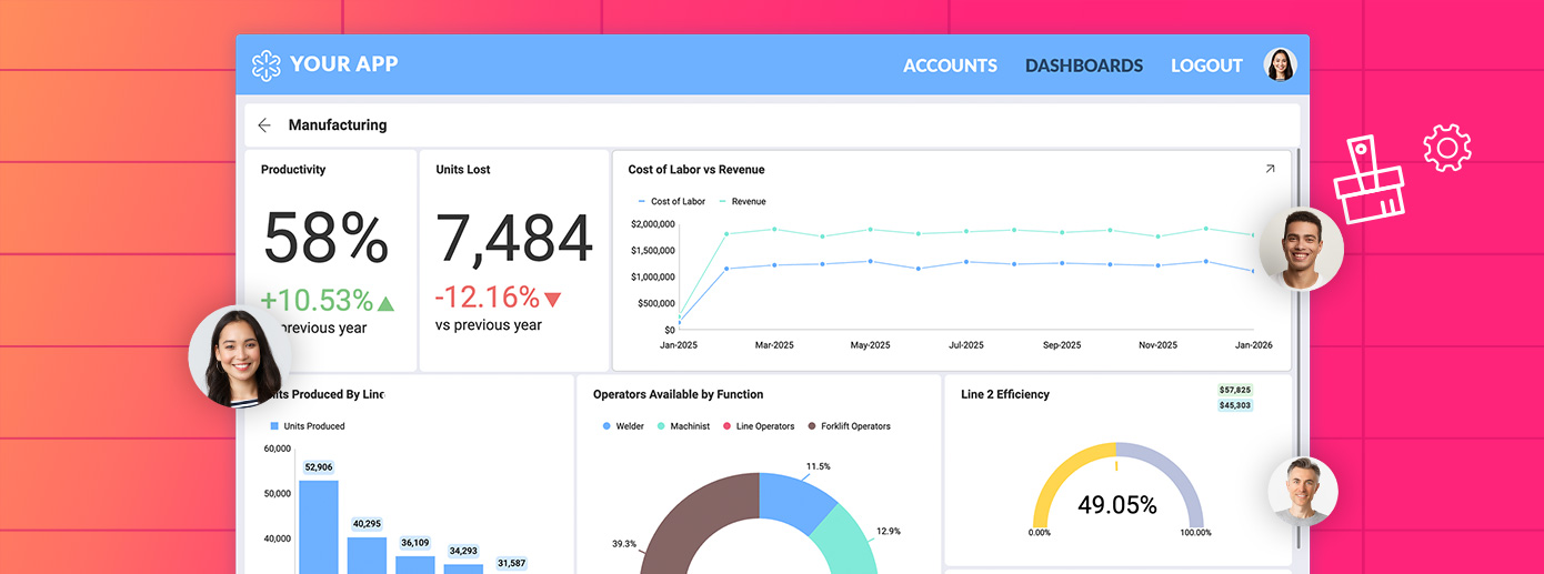
We created the various charts in this blog using Reveal business intelligence software. Learn about the features you get with Reveal and how to create other charts, dashboards, and much more.
Harness the Power of Data
Grow your business with real-time, contextual data.